Going bullish on hedge fund branding
In the world of investment, it's not just the numbers that speak volumes but also the power of the brand. When Bison Fund approached Altorise, they had a clear vision - they wanted to carve a niche in the investment landscape, showcasing their American heritage, faith in cutting-edge technology, blockchain innovation, their systematic research process, technology-led strategies, and diversified investment strategy.
Date
2022
Client
Bison
Category
Branding


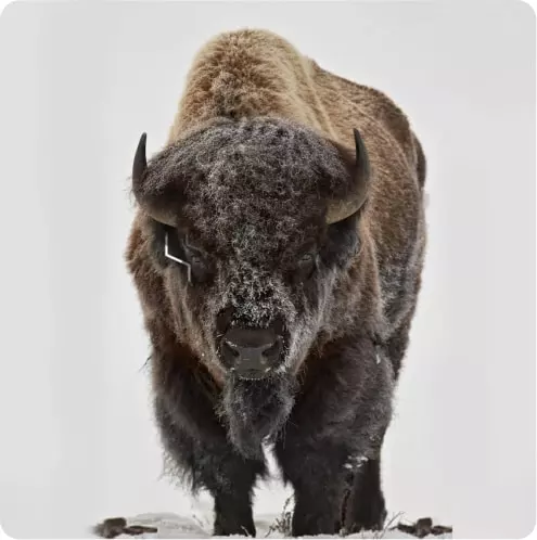
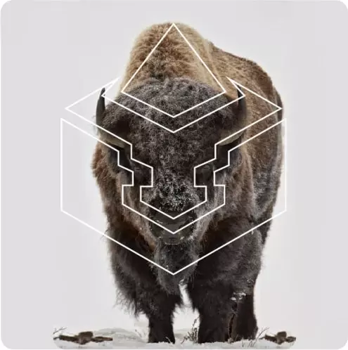
As we delved deeper into the project, we drew inspiration from Bison Fund's name itself - the Bison. A symbol of strength and stability, synonymous with America's rich heritage. The bullish connotation towards investment growth was self-evident. With a hint of the Ethereum logo's pyramid element, we paid homage to their affinity for blockchain technology.
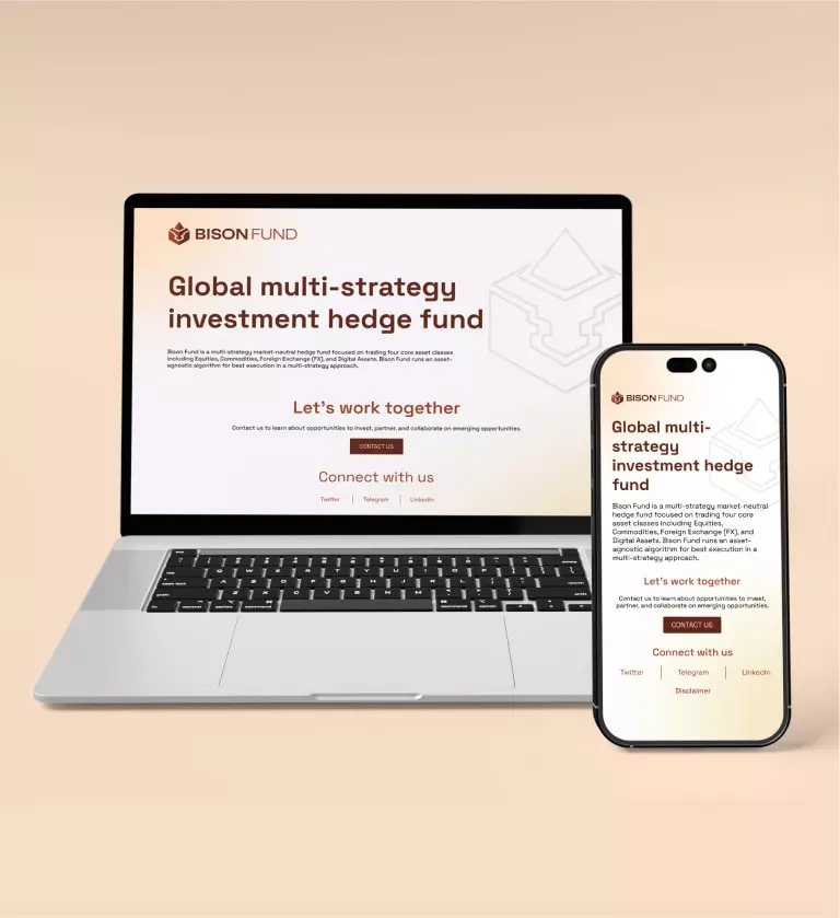
Our strategy unfolded from these insights. We employed a grounded color palette of brown to represent trust and the company's fundamental research principles. The interplay of clean lines on a grid created harmonious vision, leading us to a brand identity that was powerful, yet imbued with trustworthiness. Testing the identity across different scenarios - websites, pitch decks, marketing collateral - we found it evoked the perfect response from key stakeholders.
Color Palette

The final outcome was a testament to our collaborative journey with Bison Fund. The brand quickly became a recognizable and memorable name in the hedge fund landscape, versatile and impactful across various platforms - from the website to social media, and merchandise to business assets. It was the exact response Bison Fund's founding partners had envisioned when they partnered with Altorise. This brand didn't just represent a business, it narrated the story of Bison Fund's unwavering strength and bullish growth aspirations in the world of investment.