
“Why isn’t this converting?” You’re not alone.
Your SaaS landing page isn’t just a pretty page on your website; it should be the best SaaS landing page, designed to convert visitors into users. It’s the deciding moment. It’s where a curious visitor either clicks “Get Started” or closes the tab forever.
And if you’re building in public, launching fast, or juggling five growth experiments at once, the last thing you need is a page that doesn’t pull its weight.
So what makes a SaaS landing page different from the rest?
Unlike a homepage or a feature page, it has a single job: convert. That might mean driving a free trial, scheduling a demo, or capturing interest in your product before it even launches. But what it can’t afford to be is vague, overwhelming, or generic; especially if you’re dealing with a complex tool or a tight launch timeline.
And the numbers don’t lie: nearly two out of three marketers report that their average landing page conversion rate is less than 10% (Source: HubSpot).
That stat hits different when you realize that each SaaS landing page you create isn’t just content; it’s a critical opportunity to convert visitors and deliver the right message to the right audience, at the perfect time.
What Is a SaaS Landing Page? (And What It’s Not)
Picture this: your homepage is like the lobby of your startup; inviting, broad, and built to showcase the whole brand.
But your SaaS landing page? That’s your best-performing sales rep. Focused, intentional, and laser-locked on one thing: conversion.
A SaaS landing page is a dedicated web page built with a single goal in mind; getting the visitor to take action. That action could be:
- Starting a free trial
- Booking a product demo
- Exploring a specific feature
- Diving into an industry use case
What makes it different from a homepage or pricing page is its clarity of purpose. There’s no top nav to distract. No wandering copy. Just a sharp narrative built to help the right person say, “Yes, this is for me.”
Core Anatomy of a High-Converting SaaS Landing Page
Creating a SaaS landing page that converts visitors requires a strategic layout. Here’s a streamlined blueprint to ensure every element drives action.
-
Hero Section: Clear Value, Visual Hook, & Primary CTA
The first thing visitors see should instantly communicate the problem you solve. Your value proposition needs to be clear and paired with a compelling visual (image, GIF, or video). The primary CTA (e.g., “Start Free Trial” or “Book a Demo”) should stand out, guiding visitors toward the next step. -
Pain-Driven Headline: Speak Directly to Their Struggles
Address your audience’s pain points in language that resonates. For example, instead of “Welcome to [Product],” say, “Tired of juggling tasks? Here’s how we can help.” -
Features + Benefits Breakdown
Don’t just list features; show how they solve real problems. Focus on outcomes and benefits: “Track tasks in real-time, so you never miss a deadline.” -
Social Proof: Testimonials, Logos, and Badges
Add credibility with customer testimonials, trusted logos, and badges. Real-world validation reassures visitors that your product delivers. -
Demo/Visual Showcase: GIFs, Screenshots, or Videos
A quick demo or GIF of your SaaS in action can speak louder than words. This helps clarify how the product works and what users can expect. -
Conversion Points: CTAs, Forms, & Chatbots
Strategically place CTAs (e.g., “Start Your Free Trial”), simple lead forms, and chatbots throughout your page to encourage engagement and prompt action. Including a concise contact form can also reduce friction for visitors. -
Pricing (If Applicable)
Show clear, tiered pricing with easy-to-understand comparisons. Use psychological pricing tactics like highlighting savings or best value. -
Trust Signals: Security & Guarantees
Visitors need to feel safe. Display security badges, privacy policies, and money-back guarantees to build trust and reduce friction. -
Additional Resources: Help Docs & FAQs
For hesitant visitors, offer easy access to resources like FAQs, help docs, and integration info. This can help seal the deal for those still on the fence.
SaaS Landing Page Best Practices Backed by Data
To make your SaaS landing page truly effective, follow these best practices that are backed by real-world data.
-
Focused, Single Goal Per Page
Every landing page should have a single, clear goal. Whether it’s capturing a lead, promoting a free trial, or encouraging a demo, keeping the focus tight avoids distractions and drives conversions. -
Emotional Clarity Over Cleverness
The messaging on your page should emotionally resonate with your target audience. Skip the clever taglines and focus on addressing their pain points directly. This will make the offer feel more relevant and actionable. -
Mobile-First, Fast-Loading UX
With mobile traffic soaring, it’s essential that your SaaS landing page is optimized for mobile. Fast-loading UX isn’t just a nice-to-have; it’s necessary to keep users engaged. A slow-loading page can easily lead to abandonment, especially on mobile. -
Use Case-Based Personalization
Personalizing the page based on the user’s industry or use case significantly boosts engagement. Tailor your features and benefits to reflect the unique needs of different user segments. -
User Scroll Intent = CTA Depth
Map out your user’s scroll behavior. The deeper they scroll, the more engaged they are. Place CTAs at key points based on this behavior, making it easier for users to take action when they’re ready. -
Short Forms & Minimal Friction
Long forms can scare off potential leads. Keep forms short and ensure minimal friction by asking for only essential information to boost conversion rates. -
A/B Testing Mindset
Don’t settle for “good enough.” Continuously test different elements of your landing page; from headlines to CTAs; to see what resonates best with your audience. A/B testing helps refine your approach and maximize conversions over time. -
Social Proof
Add credibility with customer testimonials, trusted logos, and badges. Substantiating your marketing claims with user testimonials enhances credibility and trust.
The Best SaaS Landing Pages in 2025 (Curated Examples)
We handpicked standout SaaS landing page examples that nail conversion, clarity, and user experience. Each one brings something unique; whether it’s crisp copy, smart visuals, or seamless designs.
1. Mailchimp – Email Marketing SaaS
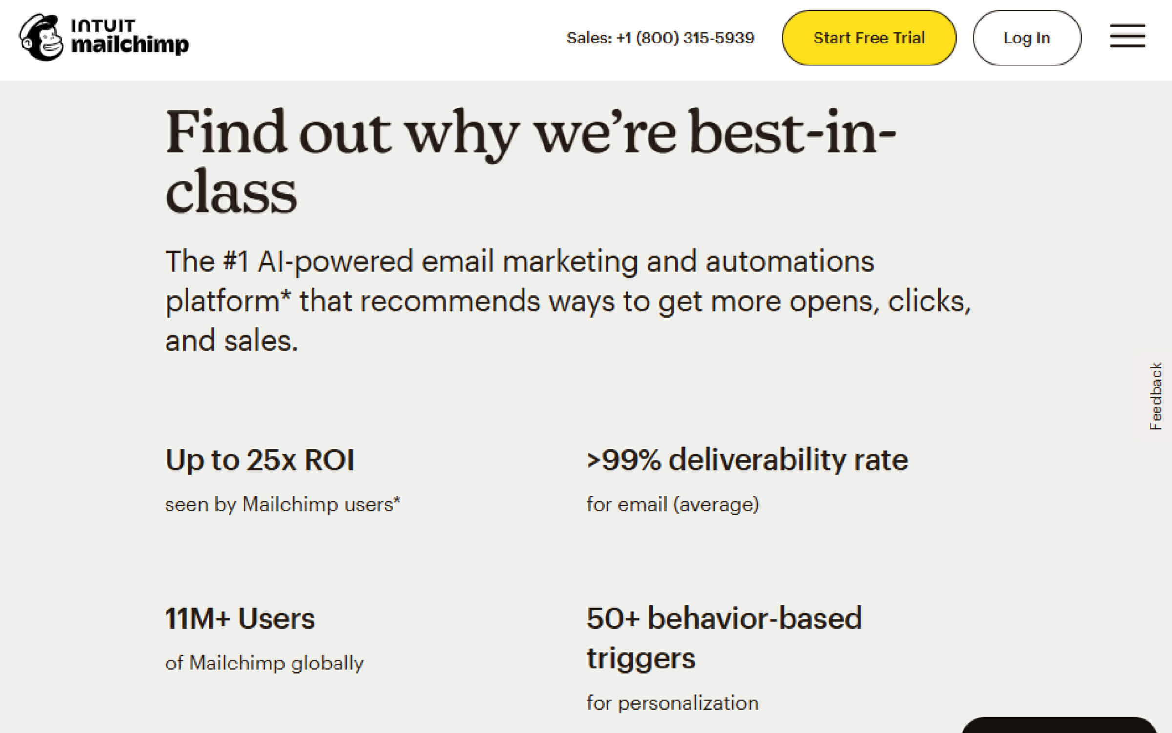
A visually rich page with a powerful hero section, ROI stats like “25x ROI seen by Mailchimp users,” and global trust signals (11M+ users). The layout flows cleanly into feature highlights, pricing, and FAQs; everything optimized to convert.
2. Figma – Collaborative Design for Enterprise
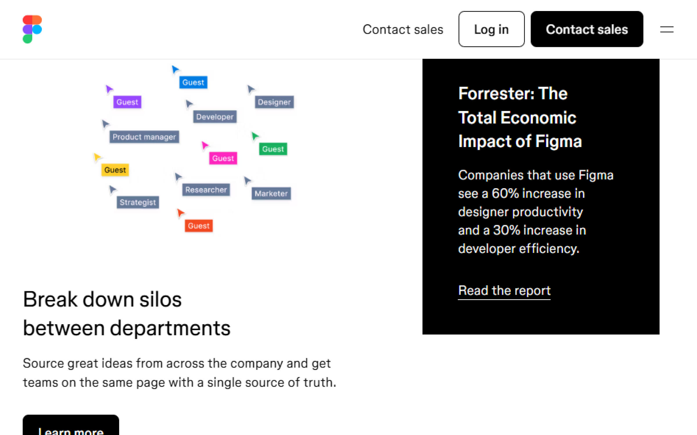
Figma’s enterprise SaaS landing page is deeply personalized, using tailored CTAs, a polished visual style, and strategic assets like economic reports and testimonies. It’s a perfect example of B2B SaaS landing page design done right.
3. Asana – Project Management
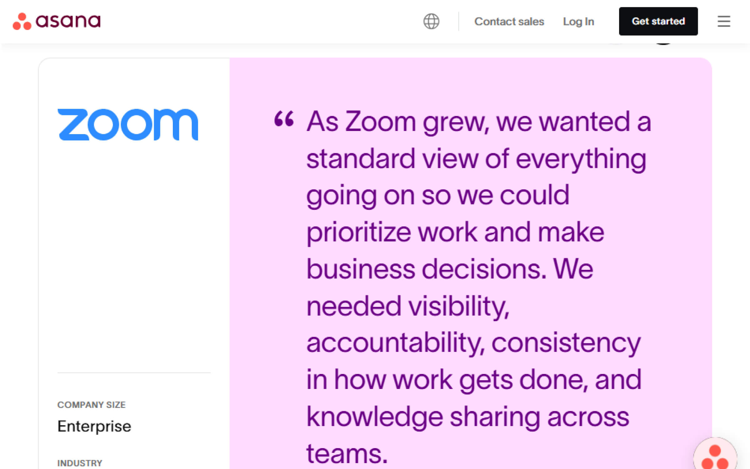
Asana keeps it minimal with whitespace and punchy one-liners. Logos and testimonials add trust, and the CTA copy speaks directly to their core audience.
4. Mixpanel – Digital Analytics

A bold hero section with a clear headline, animated CTAs, and large dashboard visuals. Microcopy like “Analytics that makes it easy to get answers” removes objections fast. The page leans heavily on social proof and smart copy to close the deal.
5. Hiver – Customer Support Helpdesk
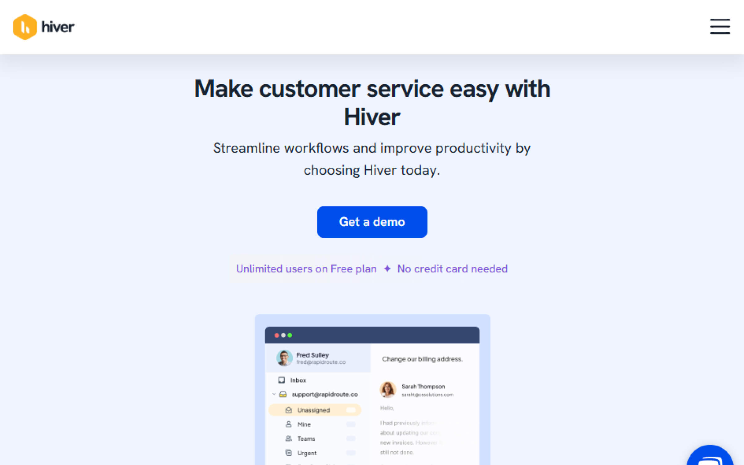
Hiver blends elegant design with conversion tactics: a strong explainer in the hero, a “No credit card required” CTA, animated GIFs of features, and stacked with testimonials and G2 badges.
6. Miro – Visual Collaboration
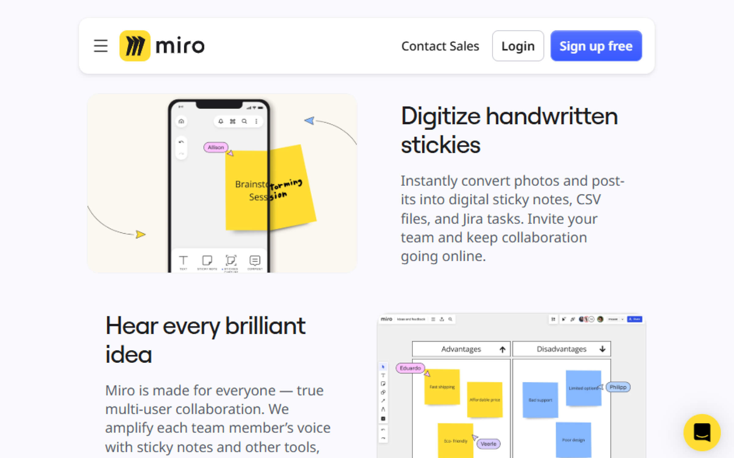
The Online Sticky Notes page features a striking yellow thumbnail, color-coded sections, and short, focused messaging. Great use of animation and testimonial placement makes it one of the best B2C SaaS landing pages.
7. Jasper – AI Copywriting Assistant
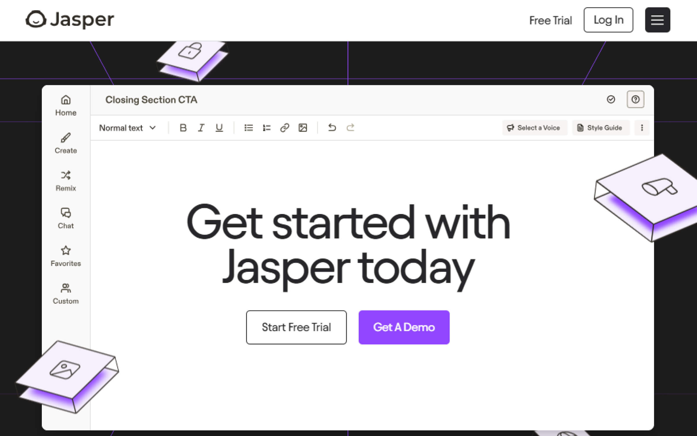
Clear headline, creative CTAs, and quick-scanning sections that speak to different audiences; marketers, founders, and agencies. The page uses trust badges and real use-case examples to make a strong case without overwhelming the user.
8. ClickUp – All-in-One Productivity Platform
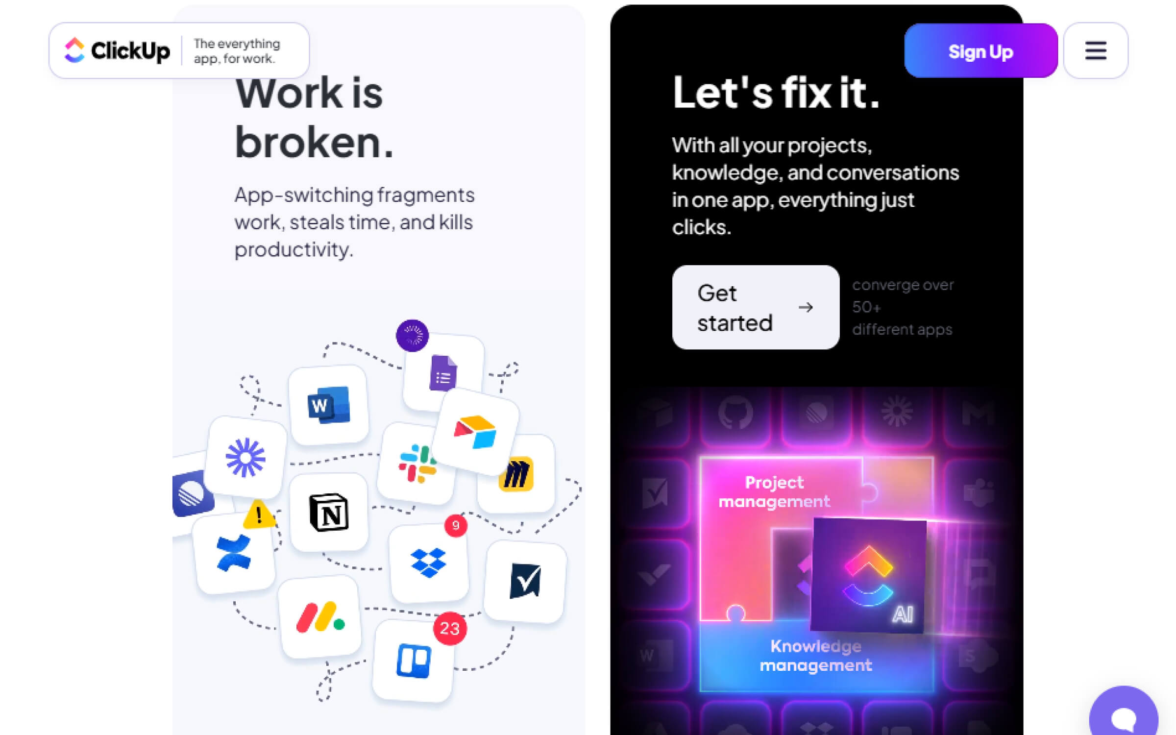
ClickUp nails visual storytelling. Animated sections explain team-specific use cases, while bold CTAs and testimonials build credibility. It’s a conversion-focused SaaS landing page for every team.
9. Loom – Screen Recording
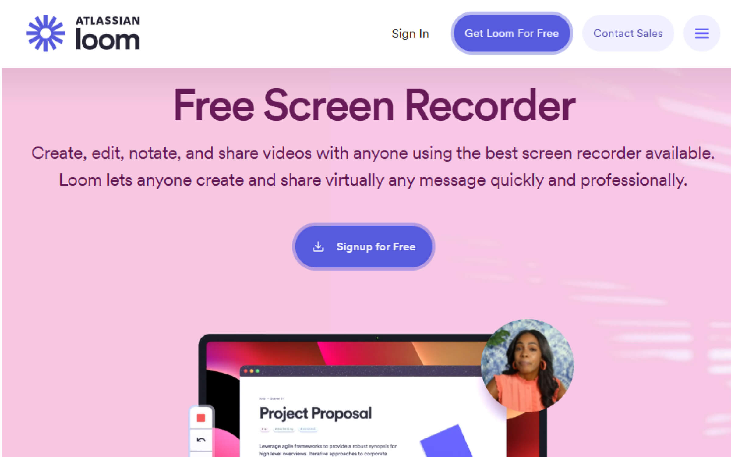
A clean, video-first landing page with bite-sized feature clips, multi-device screenshots, and rich social proof. Simple yet effective for explaining value quickly.
Step-by-Step Framework to Build or Optimize Your SaaS Landing Page
Think of this as your builder’s blueprint; whether you’re launching a new page or refining an underperforming one.
1. Define Your Audience Segment
Everything starts here. Who is this landing page actually for?
- New users? Returning leads? Enterprise buyers? Different types of users require tailored messaging and design.
- What stage of awareness are they in; problem-aware, solution-aware, or ready to buy?
- Are they looking for a quick win or a deep-dive evaluation?
Your page should speak to one specific ideal customer profile, not everyone. This sharp focus drives better messaging, cleaner design, and higher conversions.
2. Craft a Clear Offer + Outcome Promise
Don’t just sell a feature; sell the outcome.
- What am I getting?
- What problem does this solve?
- Why should I care right now?
This clarity keeps potential customers interested and engaged.
Pair this with a crystal-clear promise. For example: “Automate your reporting in minutes; no code required.” “Launch AI-generated blog posts 10x faster; trusted by 2,000+ marketers.”
This combo (offer + outcome) becomes the core of your headline, subhead, and CTA strategy.
3. Write a Conversion-Worthy Headline
Your headline has one job: grab attention and drive clarity.
- Short (5–12 words max)
- Outcome-driven or fear-relieving
- Supported by a subheadline that expands on the “why now”
Pro tip: Use “You”-focused language and power verbs. Example: “Streamline Hiring in 3 Clicks. No More Spreadsheet Chaos.”
4. Map Out Strategic CTA Placements
Your CTAs are where the conversions happen; but placement matters more than you think.
- First CTA: Above the fold, visible without scrolling.
- Follow-up CTAs: After key value sections, testimonials, or objections.
- Sticky CTA: Especially for mobile users, to avoid friction.
Each CTA should align with the user’s stage of intent; not just be a design afterthought. Clear call-to-action buttons motivate visitors to sign up for your services. And don’t forget: microcopy like “No credit card required” can meaningfully lower friction.
5. Plan Visual Hierarchy with Intent
Design isn’t decoration; it’s direction.
- Use headings and subheadings to chunk content logically
- Highlight important stats, quotes, or CTAs with contrast
- Keep high-contrast elements (like buttons or forms) consistent
Use whitespace and contrast to focus attention, not to fill gaps.
6. Add Trust Signals & Social Proof
Most SaaS landing pages lose trust before they earn a click. Don’t make that mistake.
- Logos of known customers or partners
- Short testimonials or review scores (G2, Capterra, etc.)
- Security badges, privacy assurances, or compliance certifications
- Case studies or proof of outcomes (“2x pipeline in 30 days”)
Substantiating your marketing claims with user testimonials enhances credibility and trust. Place these near CTAs or anywhere friction might creep in.
7. Test, Learn, Optimize
Your first version is just that; version. The highest-performing SaaS landing pages are built on data-backed iteration.
- Headlines and hero sections
- CTA language and positioning
- Trust signal formats (logos vs. quotes)
- Form field count and layout
- Mobile vs. desktop layout behavior
Adopt a “launch fast, learn faster” mindset. Use tools like Hotjar, VWO, or Google Optimize to back your instincts with evidence.
SaaS Landing Page Advantage Teams Overlook: SEO
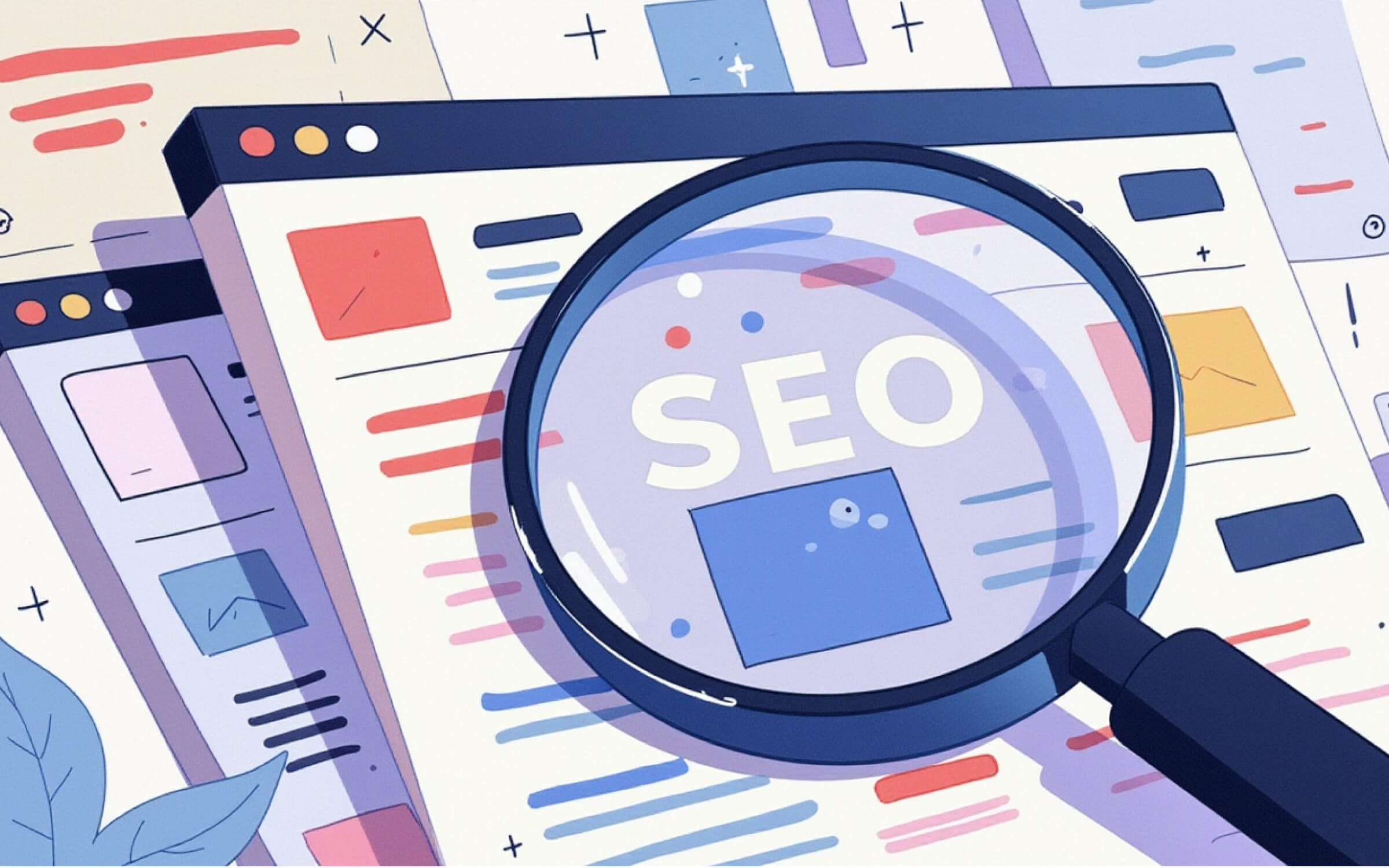
You can design the cleanest UI, write conversion-optimized copy, and even demo your product in 60 seconds flat; but if no one finds your SaaS landing page, none of it matters.
This is where SEO becomes your growth multiplier. It helps the right users land on the right page; whether they’re searching for a specific solution, trying to compare tools, or ready to start a free trial.
Why SEO Still Wins in SaaS
Your next customer probably won’t type your company name into Google; they’ll search something like:
- “best onboarding software for remote teams”
- “CRM for real estate startups”
- “try AI writing tool free”
Without SEO, your landing page might as well be invisible. And in SaaS, where buyers often self-educate, being visible at the right moment is everything.
Pro tip: SEO doesn’t replace paid or partner channels; it compounds them.
Understand Search Intent Before You Create
Before you build a SaaS landing page, ask: what kind of search is this?
- Informational → “what is cloud backup software”
Best served by blog posts or knowledge base articles. - Navigational → “Loom pricing”
Works well for pricing or product overview pages. - Commercial → “Loom vs Zoom”, “best screen recording software for teams”
Users are comparing options. This is where competitor pages, comparison pages, and industry-specific landing pages shine. - Transactional → “get started with Loom”, “screen recorder free trial”
High-intent visitors who are ready to convert.
Your SaaS landing pages should focus on commercial and transactional searches. These visitors are actively looking for a solution; you just have to make sure your page shows up and gets them across the line.
The On-Page SEO Checklist for Landing Pages
Here’s what every SaaS landing should include if you want it to rank and convert:
- Clear H1 that matches your core keyword
- Smart use of secondary keywords in subheadings (H2, H3)
- A short, compelling meta title and description
- Fast mobile-friendly design (Google notices bounce rates)
- Internal links to relevant docs, features, or plans
- Compressed images with keyword-rich alt text
- A clean URL (e.g., /demo-ai-platform not /page?id=82374)
- Schema markup for FAQs or product details (if needed)
New to this? Start with SEO basics like meta tags, headers, and internal linking. Tools like Surfer SEO or Yoast can guide you step-by-step.
Create Pages Around Search Themes, Not Just Products
SaaS companies often target multiple segments, but most only build one generic landing page.
Instead, build clusters of pages around key use cases or buyer personas:
- “Accounting software for freelancers”
- “Accounting software for agencies”
- “Accounting software for startups”
Same core product, different user, different search intent; and that’s what improves SEO and conversion.
Tools to Speed Up SEO Without an Expert
You don’t need a full-time SEO hire to get started. These tools do the heavy lifting:
- Surfer SEO → Optimize your landing pages in real-time
- Ahrefs / SEMrush → Keyword research + competitor gap analysis
- Google Search Console → Monitor real search queries + fix indexing
- PageSpeed Insights → Fix slow loads that hurt rankings
SEO + Design = Long-Term Growth
Your SaaS landing page should work for both humans and search engines. That means clear messaging, fast web performance, and content that matches what people are actually looking for.
You’re not just building a page. You’re building a 24/7 conversion funnel that brings interested customers straight to the moment they say yes.
Common Mistakes to Avoid
Even great teams miss the mark. Watch out for these SaaS landing page pitfalls:
- Feature overload: Don’t dump features; highlight benefits tied to user outcomes. Understand what people need and focus on that.
- Aggressive CTAs: Asking for too much too soon kills conversions. Start with low-friction asks.
- No clear edge: If users can’t see why you’re different, they won’t choose you.
- Mobile neglect: Over half your traffic is mobile. Design like it.
- Ad-page mismatch: If your ad says one thing and your landing page says another, trust breaks instantly.
From “Good Enough” to Growth Engine
You’ve made it this far; which means you already care about improving your SaaS landing page. That’s half the battle won. The other half? Taking confident, strategic action.
Most founders and marketers don’t struggle because they’re not trying; they struggle because the playbook feels overwhelming, advice is scattered, and everyone’s shouting about “best practices” without providing context. The truth? A high-converting landing page isn’t magic; it’s method.
If your page isn’t converting as it should, it’s likely not because you’re failing. It’s because:
- You’re trying to simplify a complex product but getting lost in too many features
- You’re overwhelmed by conflicting advice from blogs, designers, and tools
- You don’t have time to A/B test everything
- Your audience is evolving, but your page hasn’t kept up
- You’re unclear about what “great” really looks like anymore
But here’s the good news: small, strategic changes can make a huge impact. Start by revisiting your headline; does it promise an outcome, or just describe your product? Check if your CTA asks for too much, too early. Even testing just one change this week can create a 1% lift, and that adds up quickly as you scale.
Supercharge Your SaaS Landing Page
At Altorise, we’ve helped SaaS brands transform their landing pages into high-converting growth engines. Whether you need a strategic teardown, a fast revamp, or a brand-new build tailored to your funnel; we’re here to help.
We’re not just an agency; we’re your dedicated SaaS Marketing Agency, focused on driving growth.
Don’t settle for average. Let’s turn your landing page into a powerhouse. Reach out today; let’s build a page that drives conversions.

