
Ever wondered what separates an ordinary website from an extraordinary one? What makes you linger on some webpages, while others leave you clicking away in a split second? Well, we've got a fascinating quest for you. Have you ever asked yourself what the secret sauce is behind the Best SaaS Websites in 2023?
In a world where websites are our virtual doorways to everything we desire, from cutting-edge software to seamless experiences, there's something magical about those sites that truly stand out. They're more than just pixels on a screen; they're gateways to innovation, productivity, and delight.
Join us as we embark on a journey to uncover the answers. We're about to unravel the mysteries behind the best SaaS websites. What sets them apart? What design choices, content strategies, and user experiences make them shine? It's time to explore the web's best and brightest. So, grab your digital magnifying glass, and let's start this adventure together!
What is a SaaS website?
A SaaS website is the online face of a software-as-a-service (SaaS) company, often referred to as a "marketing website." It serves as a virtual storefront where visitors can explore the SaaS product or service, grasp its features, and make informed decisions about becoming customers.
At its core, a SaaS website is more than just a hub for information. It acts as a guide, ushering potential customers through their purchasing journey. Its primary goal is to captivate visitors and instil confidence in the product or service. This is achieved through compelling visuals, persuasive messages, and user-friendly navigation.
Furthermore, it facilitates customer engagement. Elements like contact forms, live chat support, and access to documentation empower visitors to seek information, assistance, and deeper insights. A SaaS website prioritizes user experience and builds trust by providing easy access to valuable resources and support.
What exactly should you expect to find on a best SaaS website?
It's the place where you get to know what a software-as-a-service (SaaS) company is all about. Think of names like Stripe, Zapier, or Figma, where you subscribe monthly to use their software. These websites are like the front doors to their digital worlds, often referred to as 'marketing websites.'
Now, let's dive into what a top-notch SaaS website should include. It's a mix of clear messaging, modern design, and various types of content that help you decide if their product is the one for you. Here's a checklist inspired by some of the best SaaS websites out there:
- Clear Value Proposition: First and foremost, a SaaS website should tell you what makes its product special. How does it solve your problems? Why should you choose it over anything else? A straightforward value proposition helps you grasp their offering quickly.
- Attractive Design: Visuals matter. A well-designed SaaS website looks professional, aligns with the brand's identity, and keeps your attention. It's like a beautifully wrapped gift that you can't wait to open.
- Key Features Overview: You want to know what you're getting, right? That's where a clear rundown of the product's features comes in. It helps you see how it stands out from the competition.
- Customer Testimonials or Case Studies: Trust is key. When you see others have had positive experiences, it gives you confidence. Customer testimonials and case studies offer that social proof.
- Pricing Information: No one likes surprises, especially when it comes to pricing. Transparent pricing, with details on different plans, helps you make informed decisions. You know exactly what you're getting into.
- Intuitive Navigation: Imagine you're in a store. You want to find what you need without getting lost. An easy-to-navigate website with a logical menu and a handy search function makes your journey smooth.
- Support and Documentation Resources: Sometimes, you need help or answers. SaaS websites offer that through various means, like live chat or FAQs. It's all about making your life easier.
- Responsive and Mobile-Friendly Design: We're on the move, and our devices come in all shapes and sizes. A website that adapts seamlessly to your screen, whether it's a desktop, tablet, or smartphone, keeps you engaged.
- Interactive Elements: Want to see how the product works? Interactive demos and tours let you explore hands-on. Quizzes or assessments help you see if it's the right fit for your needs.
- Trust Indicators: Trust is built through credibility. Security badges, customer logos, and certifications reassure you that the product is reliable. Awards and recognitions add to that trust.
So, when you're exploring these SaaS websites, remember that they're not just web pages. They're your gateway to discovering solutions, designed to make your journey as effortless as possible.
Best SaaS website designs
Ready to dive into some of the most inspiring SaaS websites out there? I've curated a list of 30 top picks that can spark your creativity and give you a taste of what excellence in SaaS website design looks like:
Ghost
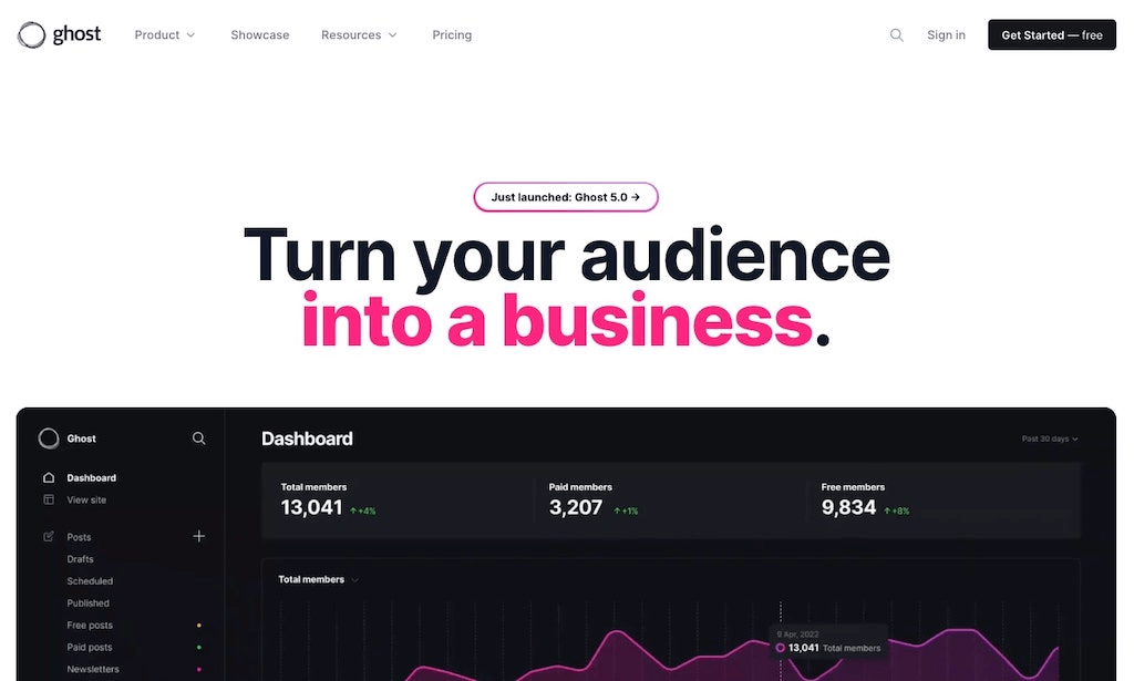
Ghost, originally known as a CMS platform tailored for bloggers, has evolved into a versatile media and newsletter platform. This transformation brought about a brand-new SaaS website, which we'll explore to uncover valuable insights.
But before we dive into dissecting Ghost's website, let's revisit what Ghost is all about.
Pros of Ghost:
- Markdown Support: Ghost provides Markdown support in its editor, allowing you to format text effortlessly.
- Content Editor with Cards: Similar to WordPress's block editor, Ghost uses cards in its content editor.
- Built-in SEO: Ghost prioritizes SEO, eliminating the need for additional plugins.
- Monetization-Friendly: It's well-suited for monetising content, making it an excellent choice for running paid online publications.
Now, let's shift our focus to Ghost's new SaaS website and its noteworthy elements.
The Navbar:
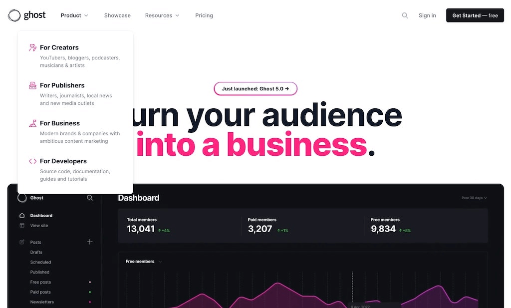
Ghost's navbar is a model of simplicity and cleanliness. It features two distinct dropdowns, one for its use case pages and another for its resource hub.
The Blog:
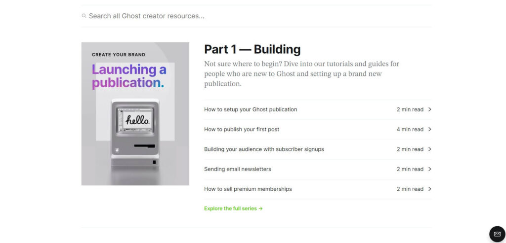
Ghost's navbar is a model of simplicity and cleanliness. It features two distinct dropdowns, one for its use case pages and another for its resource hub.
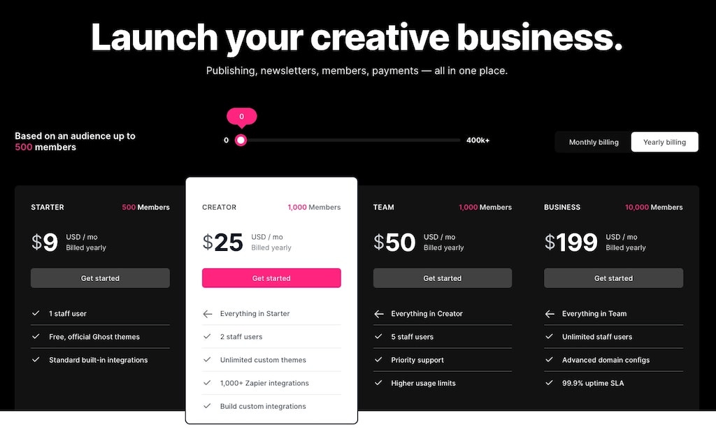
The Pricing Page:
Ramp
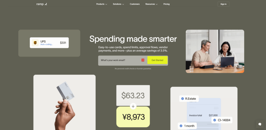
Imagine a credit card that could be a game-changer for small businesses feeling overwhelmed. The Ramp Business Card offers cashback on every expense and a comprehensive suite of bookkeeping-related perks that surpass the offerings of a typical business credit card. What's more, it doesn't burden you with an annual fee, no matter how many employees you have.
However, if you're in search of a card for carrying balances or hunting for travel perks, this may not be your ideal choice. But if simplicity and cashback savings are what your company needs, the Ramp card might just fit the bill.
Now, let's turn our attention to Ramp, a corporate credit card company boasting a beautifully crafted best SaaS website, built with Webflow.
Ramp's website is a breath of fresh air, offering clarity and effectively communicating its product's purpose and target audience. Let's explore some standout qualities that contribute to Ramp's exceptional SaaS website.
The Navbar:
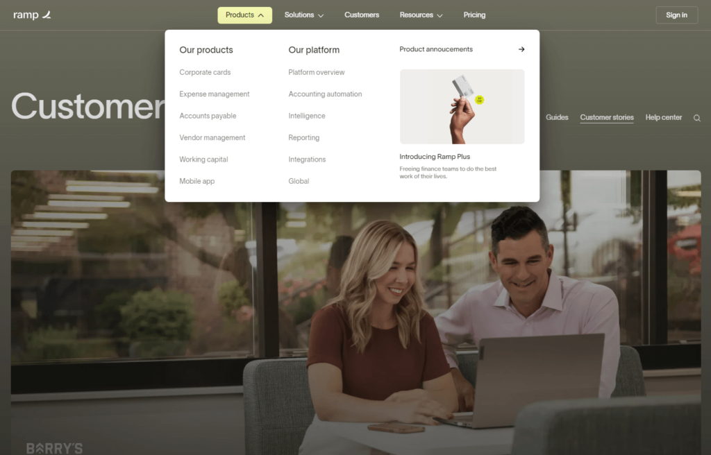
Ramp's navbar is intelligently organized with several dropdown menus, each serving a specific purpose. Every landing page accessible from the navbar either elucidates Ramp's features or delves into its various use cases. On the right side, a 'Resource' link seamlessly leads users to the blog section.
The Blog:
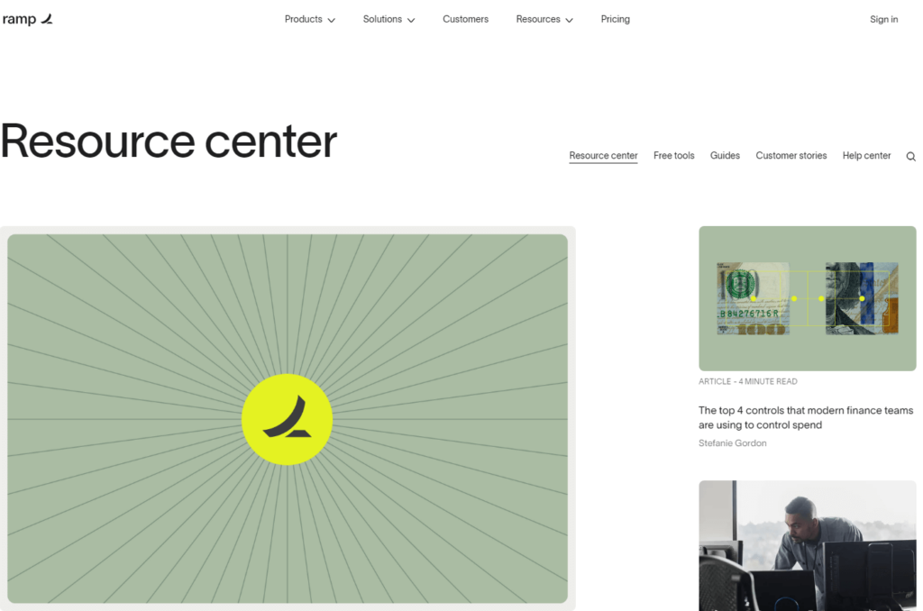
Ramp's blog design is characterized by cleanliness and accessibility. However, as in the previous example, optimizing the blog structure under a /blog/ subfolder would enhance both user experience and SEO. Currently, while individual articles exist within a /blog/ subfolder, the absence of a dedicated ramp.com/blog landing page disrupts consistency. Addressing this could significantly improve the SaaS website's user-friendliness. From a design perspective, Ramp serves as an exemplary model to study.
The Pricing Page:
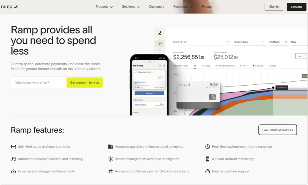
Ramp's approach to pricing, tailored for enterprises, differs from the conventional display found on most SaaS marketing websites. Instead, it focuses on persuading visitors to provide their email for more detailed information.
This strategy is particularly effective for enterprise companies seeking to collect valuable data on potential users. However, to maximize its success, a well-optimized pricing landing page is crucial. Often, visitors may bounce from a pricing page if they can't readily discern the cost.
Ramp's SaaS website embodies clarity and effective communication, showcasing the power of thoughtful design and content organization. It's a valuable source of inspiration for those seeking to create compelling SaaS websites.
ClickUp
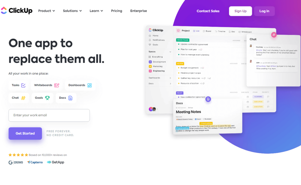
ClickUp is not your typical project management tool; it's a robust SaaS product with an impressive array of features, boasting over 1,000 integrations. From Slack and API to GitHub, OneDrive, Google Drive, Zoom, Loom, Zendesk, and Time Doctor, ClickUp seamlessly connects with the tools your team relies on. An intriguing claim stands out: After analyzing over 4,000 teams that transitioned to ClickUp, it was determined that teams save a whole day per week by adopting its solutions.
ClickUp offers workflow automation, goal tracking, and a pricing model that sets it apart from the competition: the innovative "Let's make a deal" pricing, where you have the flexibility to name the price you're willing to pay per user, per month. Alternatively, you can opt for the standard plans, which are reasonably priced at just $5 (approximately INR 409) per member, per month.
Pros:
- Over a thousand integrations.
- Seamless import from other project management systems.
- Unlimited tasks included in all plans.
ClickUp's SaaS website stands as an exceptional example, especially for those focusing heavily on SEO. With numerous landing pages meticulously designed to rank on Google, it's a goldmine of inspiration.
The Navbar:
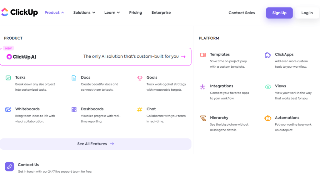
ClickUp's navbar is teeming with content, but its organization is impeccable. The dropdown menus are thoughtfully labelled, making it effortless for website visitors to explore product features, use cases, and the resource hub.
The Blog:
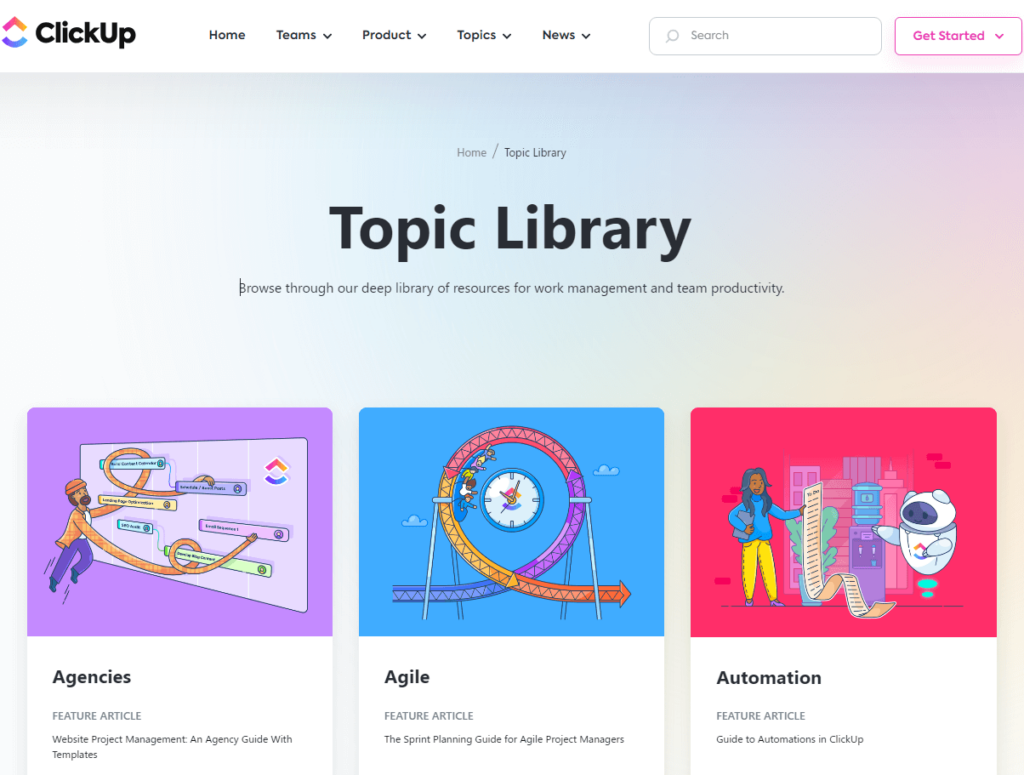
ClickUp's blog is another shining example of effective structuring. It prominently displays a clear call to action (CTA) in the blog homepage header. Additionally, their articles lead to beautifully designed individual pages, complete with a table of contents. If you seek inspiration not only for design but also for structural excellence, ClickUp stands out as one of the best.
The Footer:
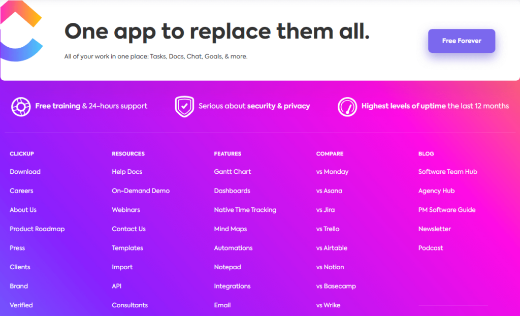
While previous examples did not delve into footers, ClickUp's footer is certainly worth mentioning. It sets a standard for what a SaaS website footer should encompass. It includes all vital links and even features a 'VS' section that compares ClickUp with its competitors. These 'VS' pages also perform well in search engine rankings. Consequently, when individuals research ClickUp to make informed decisions, ClickUp's 'VS' landing pages prominently appear in search engine results.
The Pricing Page:
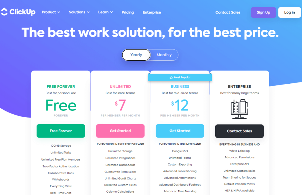
ClickUp's pricing page is a model of clarity. It effectively communicates the pricing structure, adhering to the standard format seen on most SaaS pricing pages. With straightforward pricing tiers, the absence of sliders, and a transparent presentation, ClickUp makes it exceptionally easy for website visitors to comprehend the cost structure.
ClickUp's SaaS website showcases meticulous content organization, exceptional structural design, and an emphasis on SEO optimization. It serves as a valuable reference for those seeking to create impactful SaaS websites.
🔍 Want to crack the IG algorithm? Revealing hidden secret 🕵️♀️
Welcome
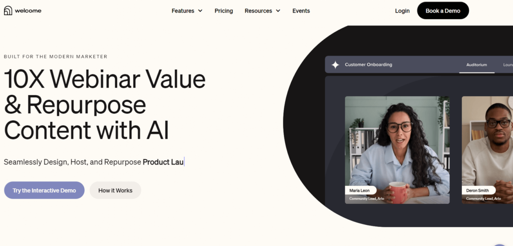
Welcome, a recipient of the prestigious Webby Award, stands as a virtual and hybrid event platform that redefines the landscape of event experiences. With Welcome, you gain access to a virtual broadcast studio that boasts impeccable video quality, pre-designed templates, and a Green Room for speakers. This innovative platform empowers you to orchestrate exceptional events that leave an indelible mark on attendees. Elevate engagement to new heights through live polls, moderated Q&A sessions, and lounge/breakout rooms.
What sets this SaaS website apart is its ability to convey its purpose and differentiation effortlessly. The homepage features a captivating "how it works" video within the hero section, providing a concise understanding of the platform's capabilities. As you navigate through the homepage, it becomes evident that Welcome is a premium product tailored for brands with a serious intent.
The Navbar:
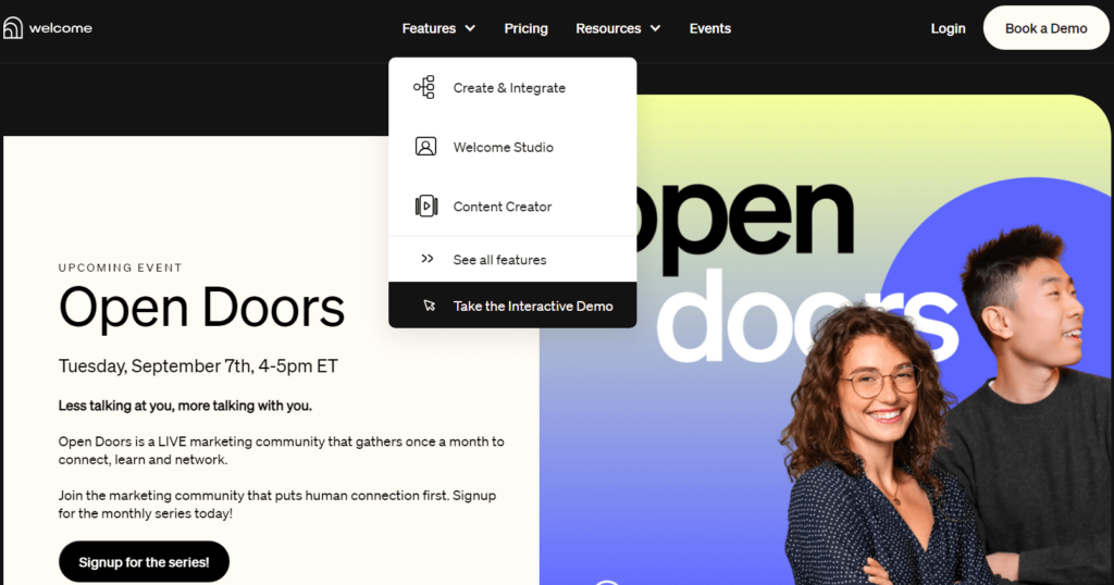
Welcome's navbar is a model of clarity and organization. It simplifies navigation by categorizing landing pages effectively, enabling visitors to explore product features, use cases, and the resource hub effortlessly.
The Blog:
Welcome's blog articles are a testament to the brand's commitment to providing valuable and easily digestible content. The articles exhibit a clean and reader-friendly design, complete with a table of contents and a well-defined style guide for enhanced readability.
Copilot
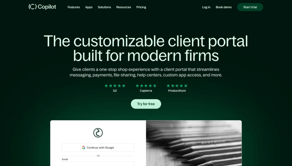
Copilot is a powerful technology platform tailored to service-based businesses, offering a comprehensive suite of tools to streamline operations and facilitate growth. With Copilot, businesses gain access to an all-in-one solution for client communication, payments, file sharing, contract management, help desk support, form handling, and more. Notably, Copilot empowers businesses to provide their clients with a cohesive and efficient experience through a unified client portal.
Today, Copilot serves as the backbone for hundreds of tech-enabled service businesses spanning various industries, including technology, marketing, financial services, and beyond. Copilot: Simplifying Service-Based Business Management Copilot is a game-changer for service providers, offering a SaaS platform that simplifies business operations and fosters growth. It serves as an all-encompassing solution for creating branded client portals that enhance communication, streamline payment processes, and simplify reporting.
What distinguishes Copilot as an best SaaS website is its commitment to simplicity in design and crystal-clear messaging. The moment you land on the homepage, you're greeted with a compelling H1 heading that encapsulates Copilot's value proposition: "Run a modern service-based business."
The website also features a demo video, social proof, prominent feature highlights, and additional resources for visitors to explore.
🚀 The Ultimate List of Must-Follow SaaS Podcasts! 🎧
The Navbar:
Copilot's navbar sets a noteworthy example that many SaaS companies can learn from. It strikes a harmonious balance between simplicity and comprehensiveness, encompassing essential elements such as feature pages, use case pages, pricing pages, and valuable company resources, including a blog. For those seeking to create a well-rounded navbar with all the necessary components, Copilot's implementation serves as an exemplary reference.
The Blog:
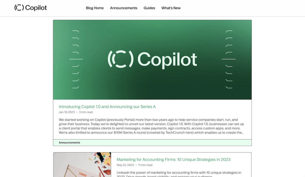
Copilot's blog articles shine with cleanliness and readability. Each Copilot blog post boasts a user-friendly design, featuring a table of contents and a well-defined style guide that enhances the readability of headings, subheadings, and paragraphs. The blog is a testament to Copilot's commitment to providing valuable content in an easily digestible format.
The Pricing Page:
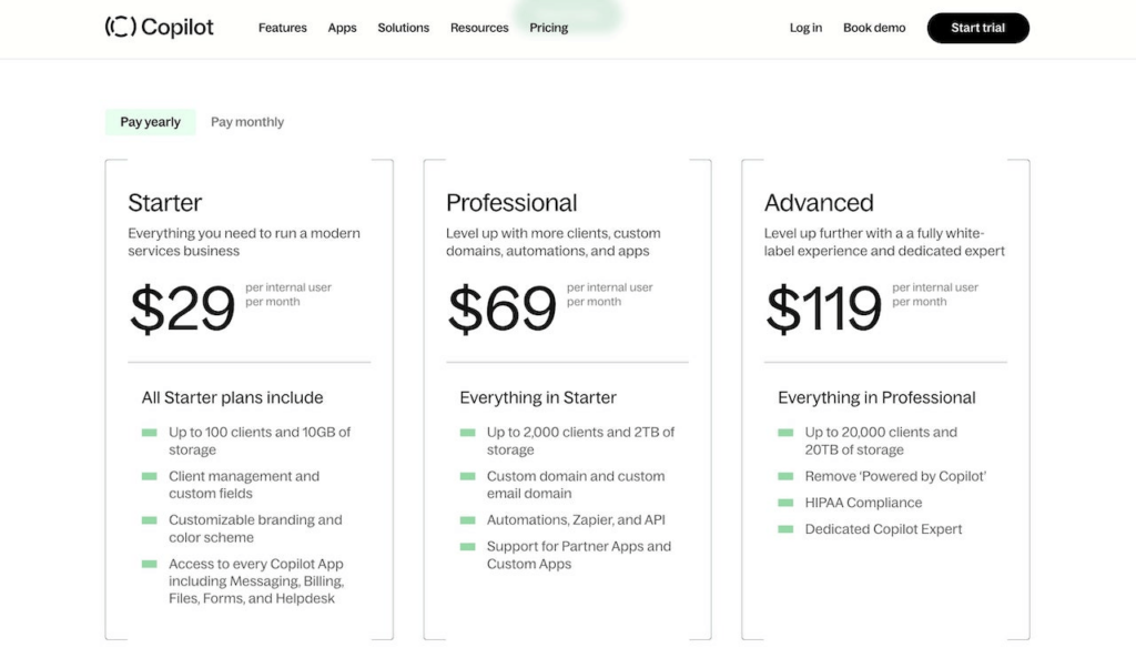
The pricing page on Copilot's website adheres to a clear and straightforward design philosophy. Abundant whitespace ensures a visually pleasing and comfortable browsing experience. From a UI/UX perspective, it excels in conveying the distinctions between different Copilot pricing plans. The pricing structure is elegantly summarized, offering three main plans: Starter: $49 per month Professional: $69 per month Advanced: $119 per month Additionally, Copilot offers an enterprise plan known as "Copilot Plus," with pricing starting at $2,000 per month.
Copilot's SaaS website stands out not only for its impressive suite of services but also for its commitment to user-friendly design and clear, compelling messaging.
Spline
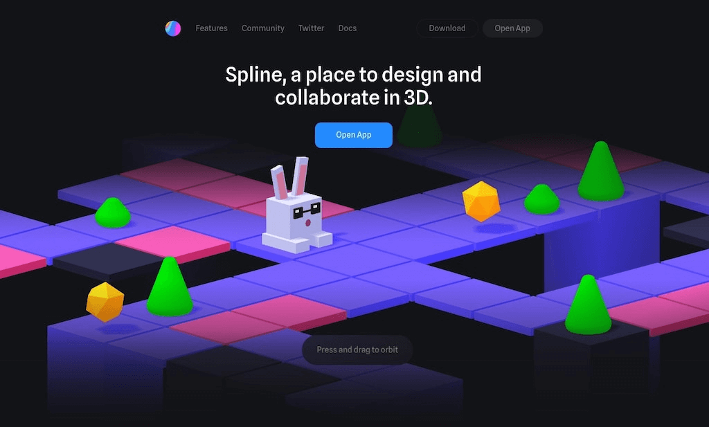
Spline, hailed as a revolutionary design tool, empowers users to effortlessly craft 3D animations and graphics, eliminating the need for coding. This versatile 3D modeler resides within the realm of photos and graphics, offering a creative canvas for users to bring their visions to life. While Spline excels in its domain, a spectrum of alternatives exists, catering to various platforms, including Windows, Mac, Linux, web-based, and WebGL applications. Among these alternatives, Blender shines as a formidable option, being both free and open-source. Additional alternatives, such as SketchUp, Autodesk Maya, Autodesk 3ds Max, and Cinema 4D, extend the list of choices for those seeking alternatives to Spline. These alternatives span across 3D modelling, game development tools, and 3D animation, providing users with diverse options to explore.
Spline beckons as a design tool that simplifies the creation of 3D animations and graphics. It exudes a clean and tech-savvy ambience, perfectly aligned with its intended audience. Upon visiting the homepage, users are greeted with an engaging and interactive experience that vividly demonstrates the tool's capabilities. This approach, effectively showcasing Spline's prowess in crafting 3D designs, entices visitors to delve deeper and consider signing up.
The Navbar:
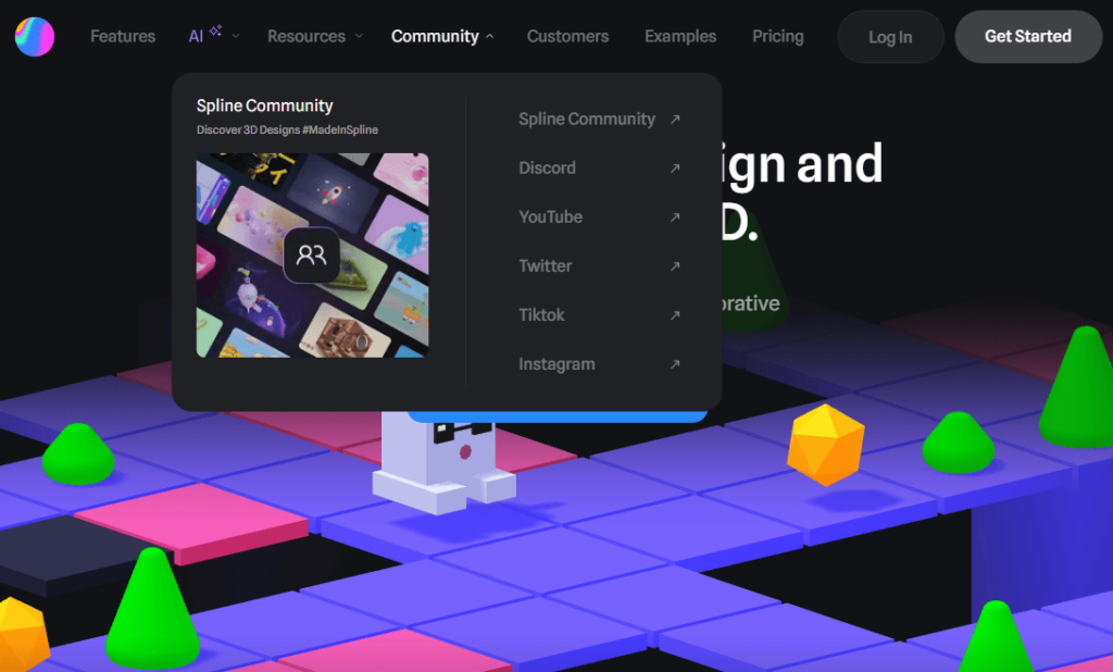
Spline's navbar adheres to a minimalist design philosophy, devoid of drop-down menus. It comprises essential links, featuring a dedicated feature page, a community link directing users to Discord, access to their Twitter page, and a documentation page.
Spline Design Docs
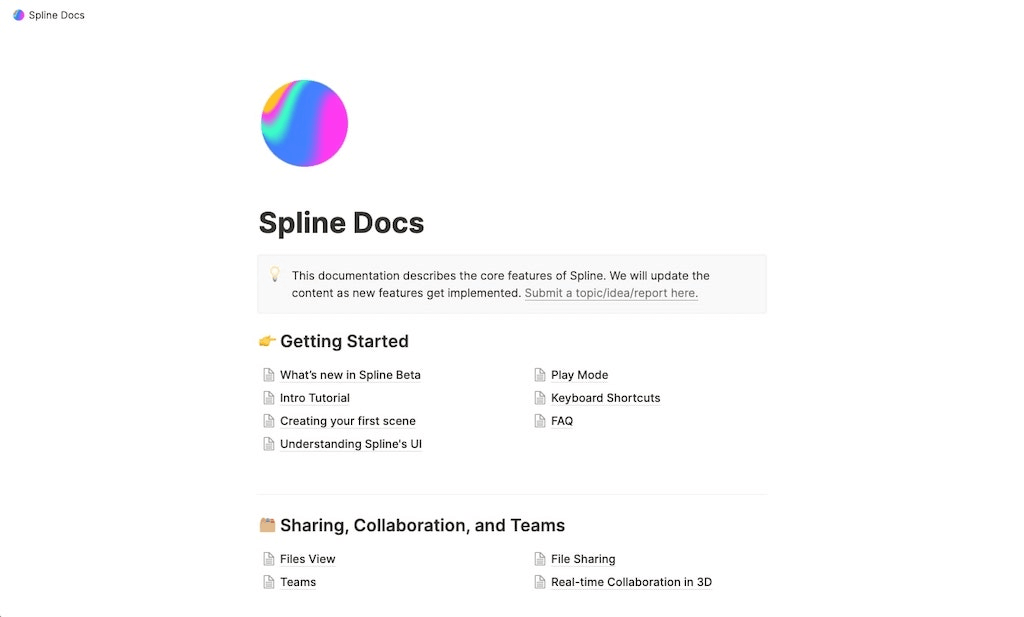
The documentation page redirects users to a Notion-style landing page, serving as a resource hub. While not the conventional structure for most SaaS websites, it provides valuable insights for those whose products are in the early stages of development and not yet ready for a comprehensive SaaS website.
The Pricing Page:
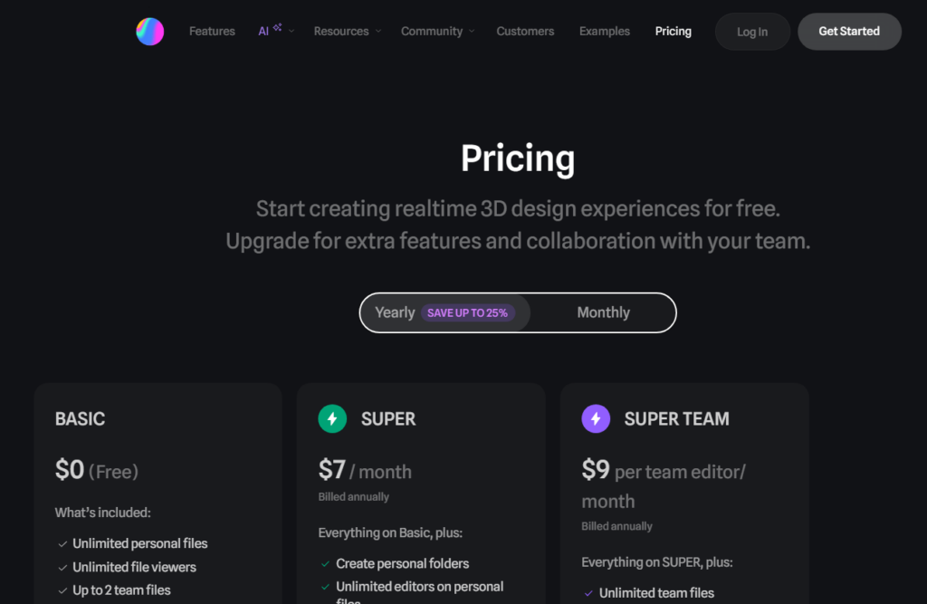
Spline caters primarily to enterprise users, reflecting in the non-standard presentation of pricing information on their website. However, Spline employs persuasive tactics to encourage users to share their email for more detailed pricing information.
Spline stands as a testament to the evolution of design tools, making 3D animation and graphics creation accessible to all. Its sleek design, interactive homepage, and unconventional documentation approach offer valuable lessons for SaaS website creators seeking to capture their audience's imagination.
🔧 YouTube errors bugging you? Unlock the mix of solutions 💡
Webflow
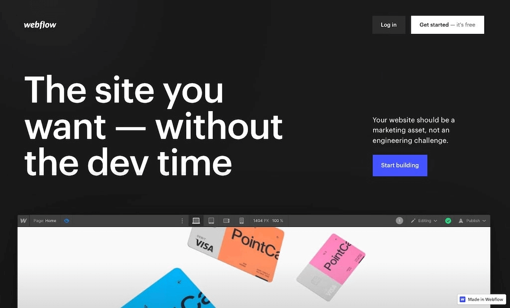
Crafting Custom Websites Without Code Webflow stands as a beacon in the world of no-code website building, offering a SaaS solution that empowers users to create bespoke websites without the necessity for coding skills. It exemplifies the epitome of excellence, aligning seamlessly with the criteria outlined in the preceding section.
Established in 2013, Webflow has emerged as the preeminent choice for designers, developers, and marketers seeking a no-code website builder. In a testament to its resounding success, the platform recently achieved a staggering $4 billion valuation, substantiated by its robust revenue figures and substantial external funding.
Webflow's SaaS website sets a remarkable standard, characterized by an unwavering commitment to brand identity and an intimate understanding of its ideal customer base. If you find yourself perusing this content, it's highly likely that Webflow will emerge as an ideal no-code platform for crafting your SaaS website. A multitude of designers and developers have harnessed Webflow's capabilities to create their own SaaS websites, and a comprehensive Webflow review is available for those eager to explore the platform's potential.
The Navbar:
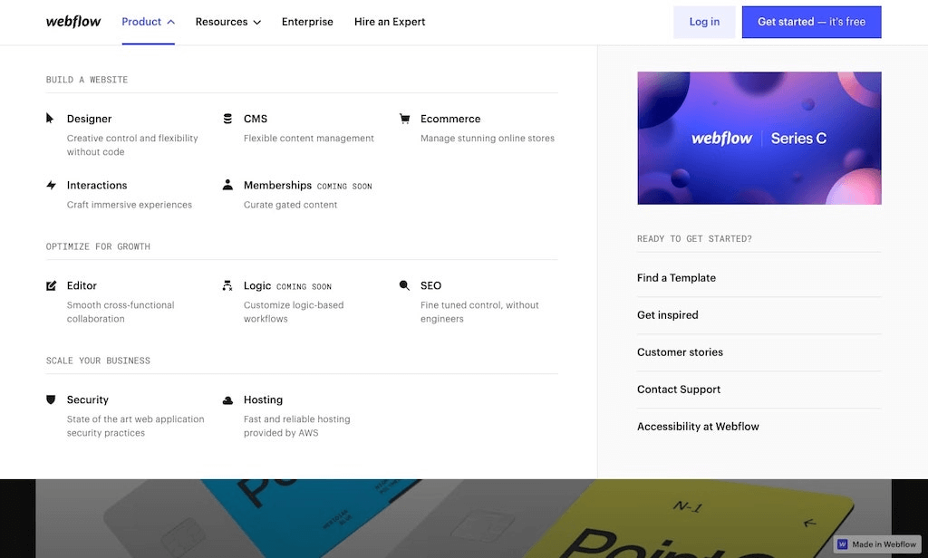
Navigational Excellence Webflow's navbar represents a paragon of intuitiveness, effortlessly guiding users to various landing pages. It serves as an invaluable source of inspiration for those in search of navbar design insights.
The Blog:
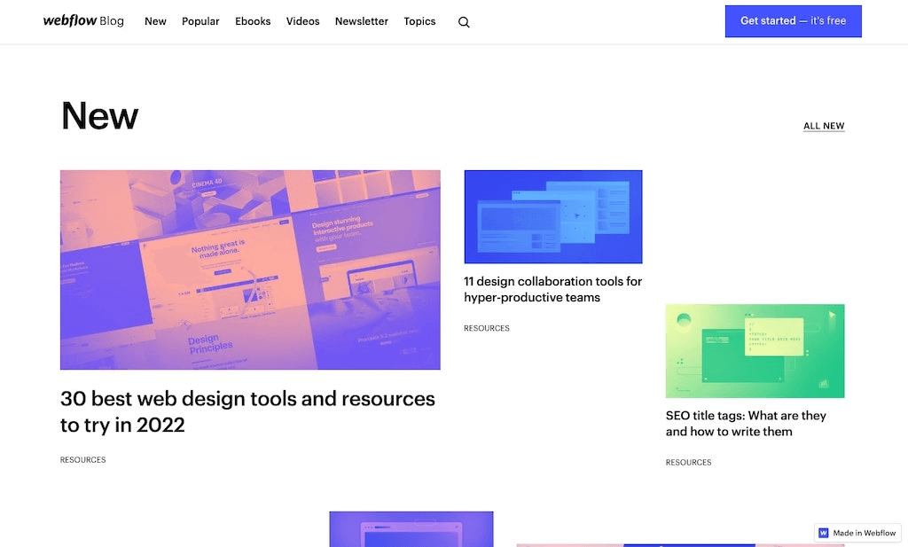
A Hub of Diverse Design Webflow's blog boasts a distinct design, diverging subtly from the overarching website aesthetic. This differentiation stems from the blog's multifaceted role as the company's media arm. Designed to allure designers and developers through thought leadership and SEO-driven content, the Webflow blog showcases versatility in design.
The Pricing Page:
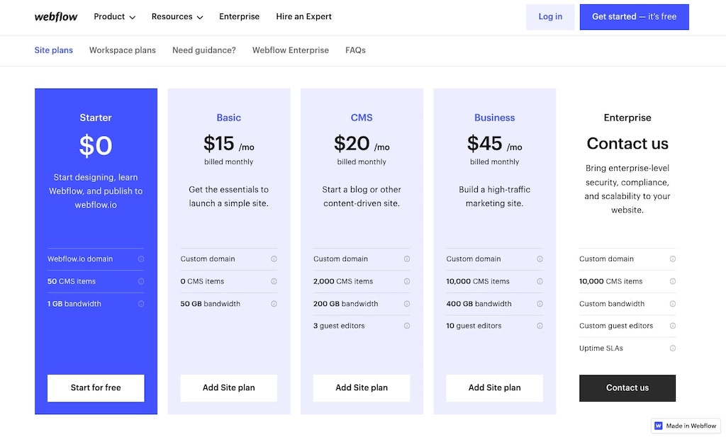
The complexity of Transparency Webflow's pricing page stands as a testament to the platform's intricate pricing model. With multiple dimensions to its pricing plans, Webflow caters to diverse user needs. Consequently, the pricing page may appear intricate to some users, reflecting the depth and flexibility inherent to Webflow's pricing structure.
Webflow reigns as a pioneering force in the realm of no-code website building. Its SaaS website embodies excellence, marrying sophisticated design with an innate understanding of its target audience. Whether you're a seasoned developer or a novice designer, Webflow offers a world of possibilities to craft your best SaaS website.
A Hub of Diverse Design Webflow's blog boasts a distinct design, diverging subtly from the overarching website aesthetic. This differentiation stems from the blog's multifaceted role as the company's media arm. Designed to allure designers and developers through thought leadership and SEO-driven content, the Webflow blog showcases versatility in design.
Butter
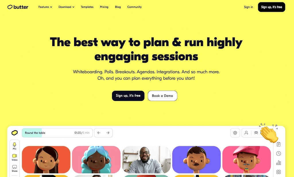
Butter is your go-to tool for transforming team meetings into engaging and efficient gatherings. As a remarkable SaaS product, Butter boasts an equally impressive SaaS website that sets a standard for simplicity and effectiveness.
Among the SaaS websites featured on this list, Butter's stands out for its straightforward yet impactful design. The homepage strategically incorporates logos from satisfied clients, providing strong social proof to reassure website visitors.
Key Elements That Elevate Butter's SaaS Website:
The Navbar:
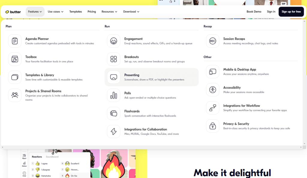
Navigational Ease Butter's navbar exemplifies a simple and effective design for SaaS websites. It features a 'Features' drop-down menu, offering a comprehensive overview of Butter's product capabilities. Additionally, the navbar provides quick access to essential pages, including templates, pricing, blogs, and community landing pages.
The Blog:
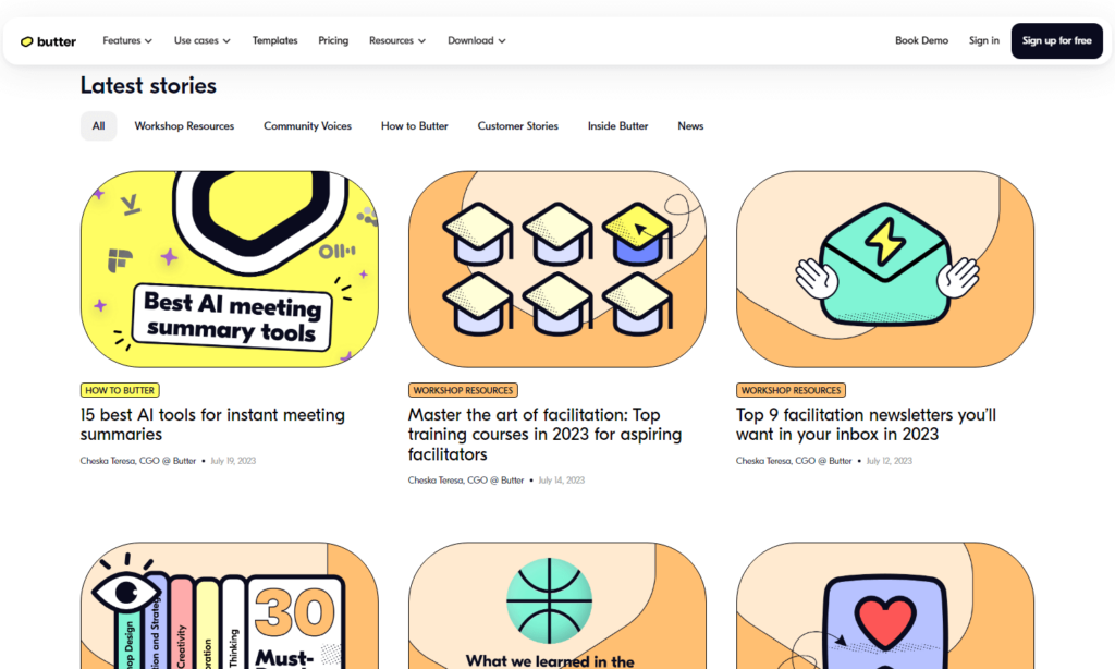
A Splash of Colorful Design Butter's blog complements its brand identity with a vibrant and user-friendly design. Category tags facilitate easy navigation between various blog topics, ensuring a seamless reading experience.
The Pricing Page:
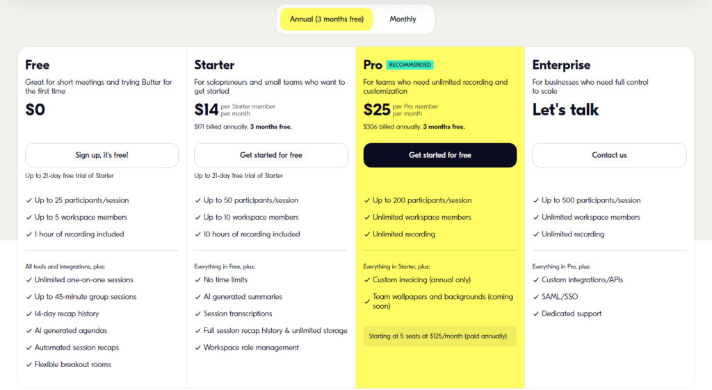
Transparency and Clarity Butter's pricing page adheres to the standards of SaaS pricing pages, presenting visitors with straightforward and comprehensible pricing options. The inclusion of a toggle between monthly and annual plans enhances user convenience. Moreover, the on-brand copy, playfully incorporating the word 'butter,' adds a unique touch to the page. Notably, the page includes an FAQ section, a valuable feature for addressing potential customer inquiries and boosting conversion rates.
Butter stands as a remarkable tool for optimizing team meetings, complemented by an exceptional SaaS website. Its blend of simplicity, effectiveness, and attention to user experience positions it as a standout example in the world of SaaS web design.
Juno
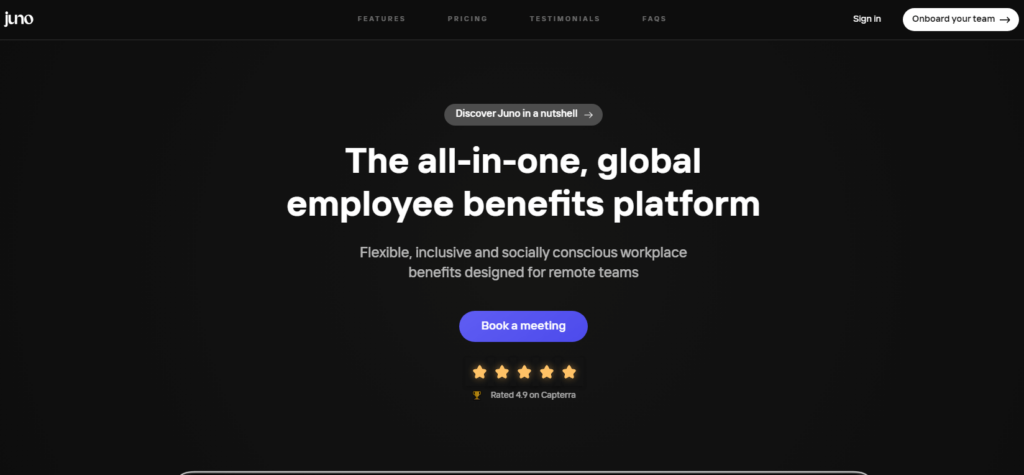
Juno: Empowering Companies to Reward Their Employees, a leading SaaS platform, specializes in helping businesses recognize and reward their employees through flexible benefits. Their commitment to clarity and transparency shines through their website, where they seamlessly convey their mission and value proposition.
The website's design strikes a delightful balance between vibrancy and professionalism, using a playful color palette while maintaining ample white space and clean typography. Juno also bolsters its credibility by prominently displaying a list of satisfied customers on the homepage, providing valuable social proof.
Exploring Juno's Key Website Elements:
The Pricing Page:
Similar to Butter's pricing page, Juno's pricing section follows the industry standards of cleanliness and user-friendliness. Notably, they enhance the decision-making process by including a checklist that outlines each plan's offerings, simplifying the selection process.
The Blog:
Juno's blog adheres to the conventional structure found on most SaaS websites. They demonstrate good URL structuring by employing the '/blog/' subfolder for both the blog homepage and individual posts. Additionally, they embed podcast episodes on the blog homepage, showcasing valuable content. However, creating a dedicated landing page for their podcast and featuring it in the navbar or resource center could enhance its visibility among new visitors.
Juno's SaaS website excels in effectively communicating its mission and benefits to businesses seeking employee recognition solutions. Its engaging design and thoughtful approach to clarity make it a valuable source of inspiration." Feel free to provide further guidance or specify if you have any preferences for a different style or tone.
🚨 Shocking Truth About IG DM Hacking! Learn How to Protect Yourself 😱
Thrive
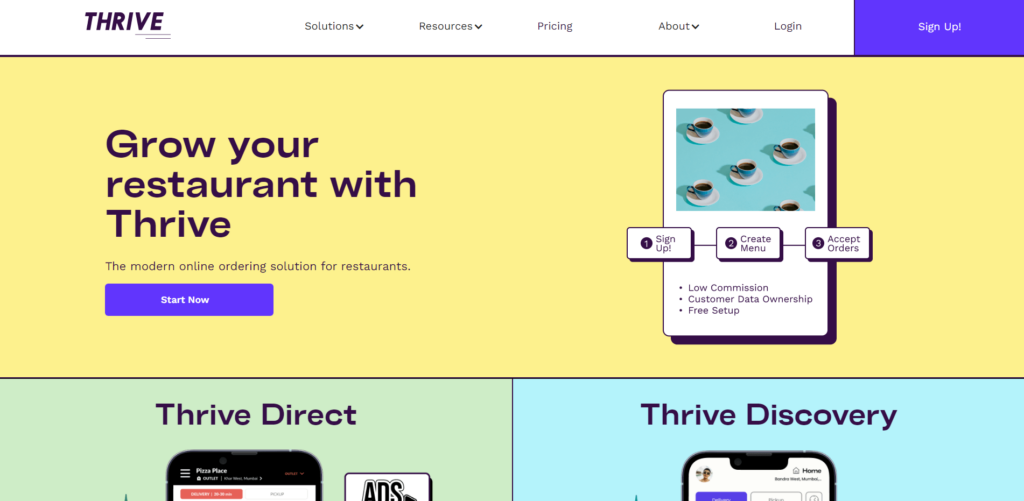
Thrive, a prominent SaaS platform, specializes in revolutionizing restaurant ordering suites to encompass table ordering, pickup, and delivery services. It proudly stands as the sole platform that not only streamlines these crucial aspects but also guarantees the allure of repeat orders through its meticulously crafted marketing strategies and robust loyalty programs.
What distinguishes Thrive as an exemplary SaaS website is its commitment to simplicity in design and unwavering clarity in messaging. From the moment you land on the homepage, you're greeted with a bold H1 heading that encapsulates Thrive's core value proposition—empowering you to operate a contemporary, service-based business.
Let's delve into some remarkable attributes that make Thrive's website exceptional:
The Navbar:
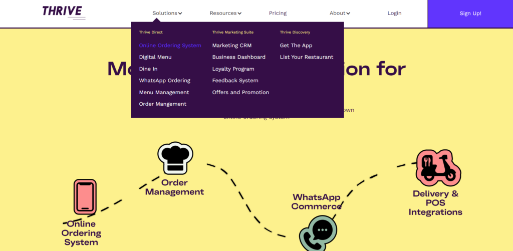
Thrive's navbar serves as an excellent model for other SaaS companies to emulate. It strikes a harmonious balance between simplicity and comprehensiveness, encompassing feature pages, pricing details, and essential company resources, including a blog.
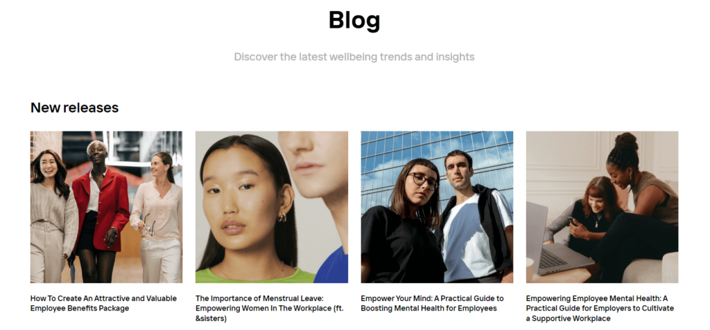
The Blog:
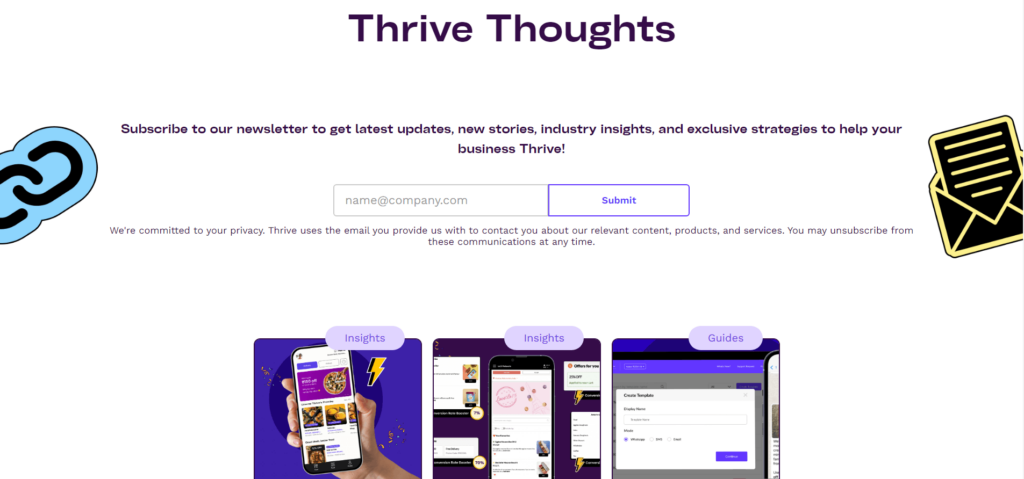
Thrive's blog is a testament to the platform's commitment to excellence. Each blog post adheres to a meticulous style guide that enhances the readability of headings, subheadings, and paragraphs, ensuring an enjoyable reading experience for visitors.
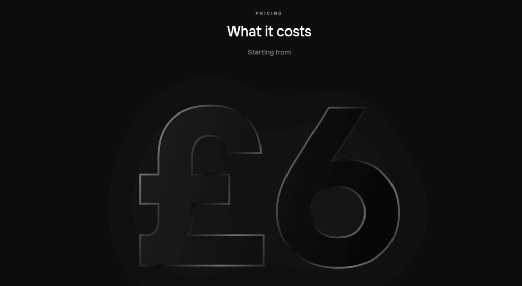
The Pricing Page:
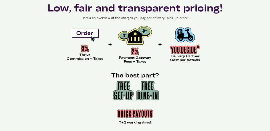
Thrive's pricing page is a paragon of clarity and simplicity. Ample whitespace contributes to an aesthetically pleasing and user-friendly interface. More importantly, it excels in terms of user experience by concisely presenting the distinctions between various Thrive pricing plans.
Thrive is not just best SaaS website; it's a catalyst for elevating the restaurant industry's standards. Join the ranks of thriving businesses today and experience the future of restaurant ordering with Thrive.
Sancode Technologies
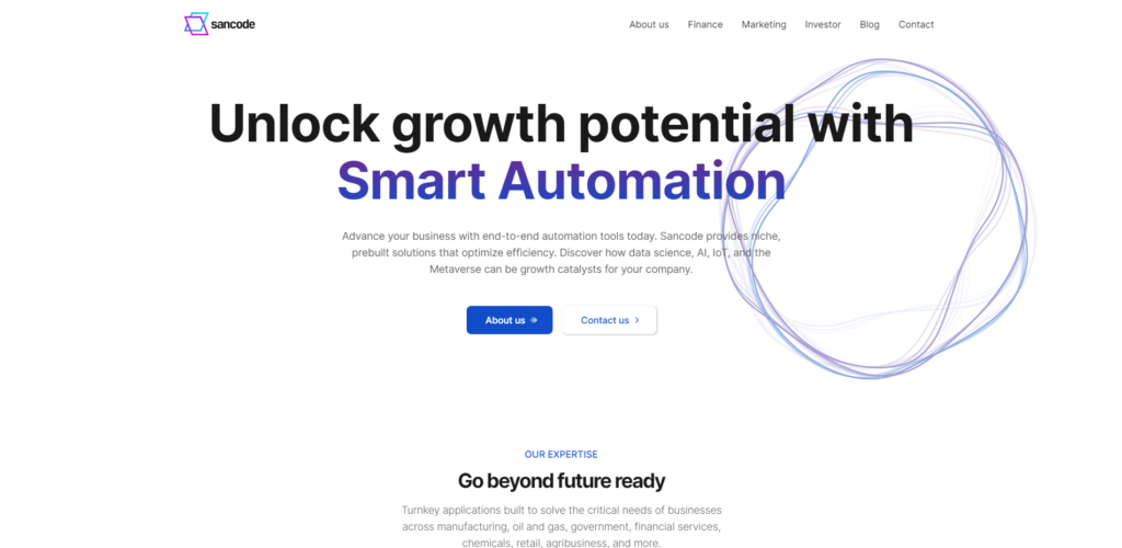
Sancode Technology is a pioneer of innovation, offering state-of-the-art smart automation tools that empower businesses to advance and excel in a constantly evolving landscape.
Their website, built using Webflow, embodies a clean and minimalist design, earning it a place among the best SaaS websites characterized by minimalistic web designs.
The homepage offers a comprehensive package, featuring elements such as social proof, product functionality, operational insights, addressing potential concerns, and a compelling call to action to begin your journey. It serves as a prime example of what an exemplary SaaS homepage should encompass.
The Blog:
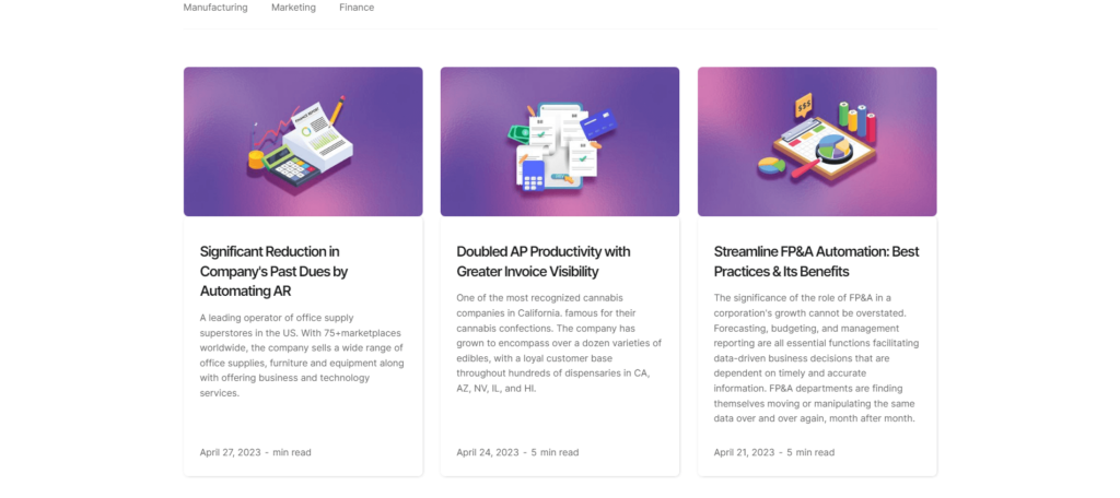
Each article adheres rigorously to a style guide, enhancing the readability of headings, subheadings, and paragraphs, thereby ensuring a delightful reading experience for our esteemed visitors.
Sancode transcends being a mere SaaS platform; it serves as a dynamic catalyst propelling the automation industry to new heights. Join the league of thriving businesses today and embrace the future of marketing and finance automation with us.
Tranch
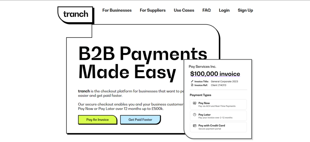
Tranch is a dynamic SaaS product designed to simplify expense financing for growing businesses. This fintech SaaS website uniquely combines a playful design with a typically serious subject—financial management.
The website's clever use of whitespace, complemented by vibrant splashes of color, ensures that typography and graphics take center stage on the homepage. Tranch's website navigation is elegantly simple yet provides ample information for exploring its rich array of features and use cases.
Although a blog section isn't readily apparent, and a pricing page is conspicuously absent, it appears that Tranch's primary call to action is to engage visitors immediately. It seems they aim to identify and engage with genuinely interested prospects before providing more detailed information. One standout aspect of this website, however, is its well-crafted FAQ page. The
FAQ Page:
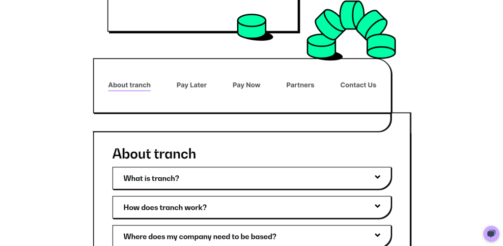
Tranch has chosen to go the extra mile by incorporating an FAQ page—a rarity among SaaS websites. This thoughtful addition serves to promptly address potential customers' inquiries. The FAQs are intelligently organized into clickable topic categories, setting a valuable precedent for other SaaS companies.
Decodable
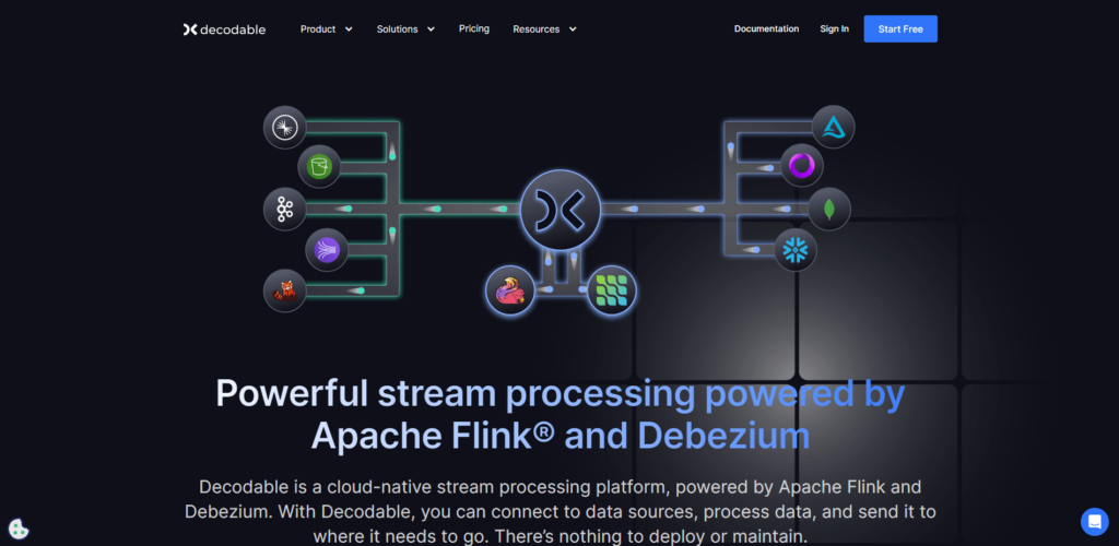
Decodable empowers businesses with its cutting-edge data engineering platform. This platform equips applications and data engineers to construct data pipelines that efficiently process and deliver data to both offline and online systems. It boasts a wide array of services, including real-time data ingestion, integration, analysis, and event-driven service development.
The homepage of Decodable exudes a sense of cleanliness and sophistication, enhanced by carefully applied dashes of colour. While it leans toward a dark-mode aesthetic, this choice aligns seamlessly with its target audience—primarily developers.
The Navbar:
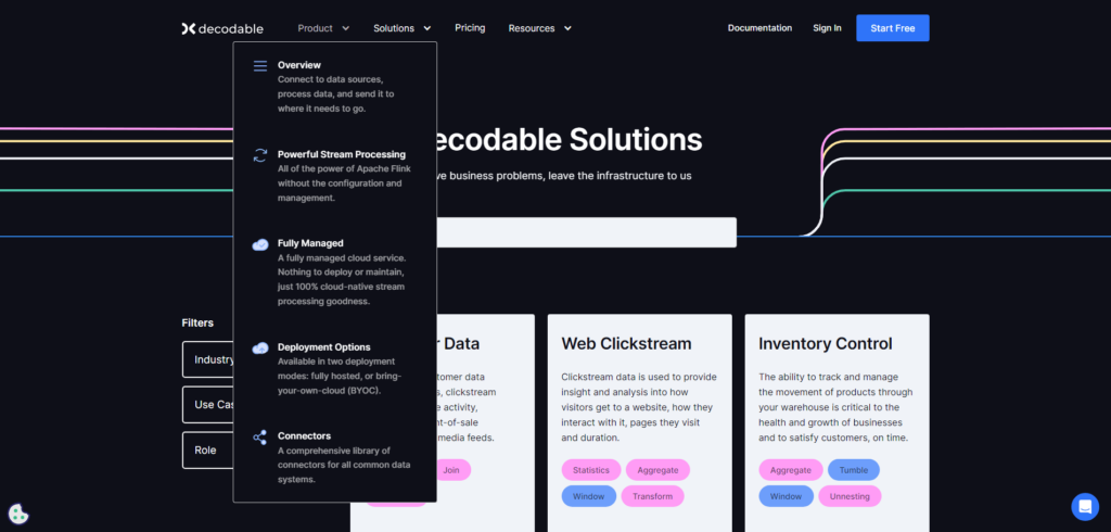
Decodable's navbar is thoughtfully organized, seamlessly connecting visitors to all crucial pages, ensuring a user-friendly experience.
The Pricing Page:
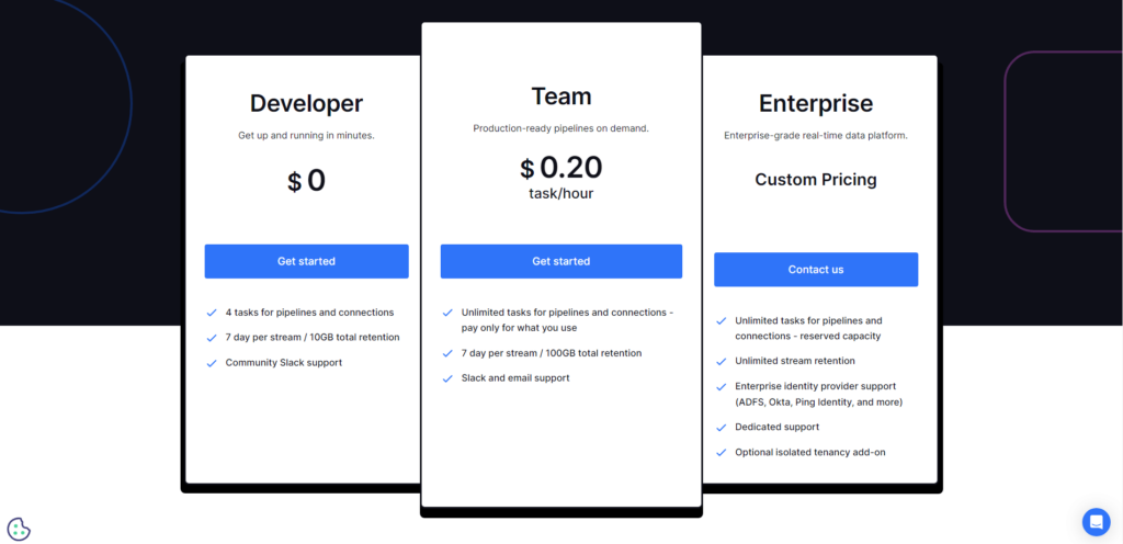
Decodable's pricing page adheres to the standard model used by many SaaS websites. It presents transparent pricing tiers based on usage, reflecting its business model.
The Blog:
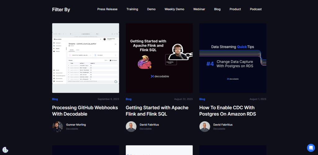
Decodable's blog sets a remarkable example for SaaS websites with its straightforward yet captivating design. The blog's homepage features a prominent featured post and convenient topic filters for exploring blog content.
Moreover, individual blog post pages are thoughtfully designed, providing readers with a seamless and engaging experience, complete with a helpful table of contents—an element worth emulating.
If you aspire to craft a jaw-dropping, user-friendly SaaS website that leaves a lasting impression, look no further. Altorise, a top-tier UI/UX design agency, is your dedicated partner in achieving this goal, particularly within the dynamic SaaS and cryptocurrency industries. Our passion lies in transforming your vision into an exceptional digital reality. With a keen focus on user experience and interface design, we ensure that your SaaS website not only captivates but also intuitively guides your visitors, making their journey seamless and enjoyable. Altorise's expertise extends beyond aesthetics; we dive deep into the unique needs of the SaaS and cryptocurrency sectors. Our design solutions are tailored to these industries, addressing their specific challenges and opportunities. Intrigued? Ready to turn your SaaS website dreams into reality? Reach out to Altorise, where innovation, creativity, and user-centric design converge to set your brand apart in the digital realm.
If you believe your SaaS website stands out as the best in your industry, don't hesitate to reach out to us at pr[at]altorise.com. We welcome the opportunity to showcase your exceptional platform and list it among the industry leaders.


Pingback: Unveiling the Secrets of Instagram Story: Answering Your Questions